Fluent UI v9: Optimize PCF with Best Themes
Enrich Power Apps with Fluent UI v9 for eye-catching, themed custom components.
Key insights
Embracing Modern Theming: The blog begins with the excitement for creating colorful applications that align with app theming, specifically mentioning Fluent UI v9. The documentation recently expanded on how to utilize theming and provides examples of modern theming API usage.
- Understanding the implementation of theming to ToDo dataset examples based on Fluent UI v9.
- Overview of Modern Controls activation in Canvas Apps and Custom Pages, allowing for the application of various themes.
- Demonstration of themes applied to modern controls and an overview of theming in Model-Driven Apps, showing classic and modern customization.
- Insight into the ease of applying themes to PCF components using Fluent UI React v9 and the FluentProvider wrapper.
- Exploration of creating personalized themes using BrandVariants and the Theme Designer for Fluent UI v9, with the possibility of customizing themes in Model-Driven Forms and future dark mode considerations.
The central topic of the blog post revolves around the customization and application of themes within Power Apps Component Framework (PCF) by utilizing Fluent UI React v9. It discusses the versatility between standard theming provided by the platform and the ability for developers to create custom themes, offering a more personalized touch to their apps. The blog also delves into the difference between applying theming in Canvas and Model-Driven Apps and provides insights on how to accomplish this technically. Moreover, it hints at potential future implementations like themes for dark mode within app designs.
Understanding PCF Theming and Design
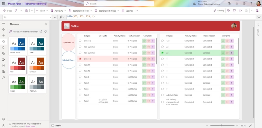
Theming in Power Apps, both Canvas and Model-Driven, has evolved significantly with the introduction of the Modern Controls and Fluent UI v9. The blog touches on the flexibility of choosing from a variety of themes for Canvas Apps and Custom Pages, leveraging the Fluent 2 Design System. It describes the steps for enabling Modern Controls within app settings, thereby applying theme choices across various components. For Model-Driven Apps, it differentiates between classic theming customization and the newer XML WebResource-based modern theming that currently affects the App Header.

The post further illustrates the straightforward process of applying themes to PCF using Fluent UI React v9 components, by encapsulating components within a FluentProvider with a specified theme. This showcases the influence of app theming on the visual presentation within a Canvas App/Custom Page environment, highlighting the transformation with different theme applications on a ToDo dataset example.
Customization is a key point discussed in the post, where it emphasizes the use of the Theme Designer to design and preview desired themes. Developers can pick a base color, and the designer automatically generates a color palette, which can be exported for use within their apps—a process allowing for a seamless transition from standard theming to a more personalized approach.
The blog closes with details on using npm libraries and parameters for creating brand ramps, even considering dark mode theming, which is expected in the future. It concludes by predicting a trend towards more vibrant, colorful apps, enabled by these advanced theming capabilities.
To further elaborate on the main topic, theming within Power Apps Component Framework (PCF) using Fluent UI v9 allows developers to create visually appealing, unified app designs that maintain consistency with the overall branding and design language. The modern theming API and Theme Designer provide the tools needed to both utilize pre-defined themes and create custom themes, leveraging color ramps for tailored user experiences. The ease with which themes can be applied to both Canvas and Model-Driven Apps underscores the flexibility of the Power Apps platform. Moreover, the blog hints at the exciting potential for adapting themes to dark mode, anticipating future enhancements that align with user preferences and accessibility standards.
Read the full article Standard or Custom Theming for PCF using Fluent UI v9

People also ask
Who uses fluent UI?
Fluent UI is widely used by developers and designers who create web and mobile applications, especially those within the Microsoft ecosystem. It is also utilized by Microsoft for their own products, such as Office 365, to provide a consistent look and feel across their various platforms and devices.
What is fluent UI Web components?
Fluent UI Web Components is a collection of cross-platform web components based on Microsoft's Fluent Design System. These components are designed to be framework agnostic, which means they can work without dependencies on a particular front-end framework and can be used in various web application projects.
What is the component of the fluent UI?
The components of Fluent UI consist of a wide range of UI elements such as buttons, checkboxes, sliders, text fields, navigation menus, and more. The library also includes utilities for theming, accessibility, and internationalization to build a complete user interface that adheres to Microsoft’s Fluent Design principles.
Does fluent UI support react 18?
As of the last knowledge update in 2023, Fluent UI provided official support for React, including the latest versions. However, specific support for React 18 should be checked in the up-to-date documentation or release notes for Fluent UI, as the project is under active development and support for new versions of React is frequently updated.
Keywords
PCF Theming Fluent UI v9, Custom PCF Themes Fluent UI, Standard PCF Design Fluent, PCF Fluent UI v9 Customization, Fluent UI v9 PCF Styling, PCF Fluent UI Theme Options, PCF Fluent v9 Design Themes, Customize PCF Fluent UI v9, PCF Standard Fluent UI Themes, Fluent UI Version 9 PCF Themes