Power Apps
Jan 27, 2025 5:00 PM
Power Apps: The Modern Date Picker UI in Minutes!
Power Apps, Modern Date Picker, Microsoft Fluent 2, Date Format, ValidationState, OnChange, Usability, Data Integrity
Key insights
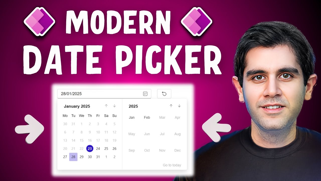
- Modern Date Picker UI: Learn how to use the Modern Date Picker control in Power Apps to improve functionality and user experience with an intuitive interface, ensuring accurate date input and reducing errors.
- Key Features: The Modern Date Picker is built on the Microsoft Fluent 2 design system, offering enhanced usability and easy configuration. It ensures consistency and data integrity by replacing text input with a structured date selection tool.
- Date Formats: Customize date display formats such as Short (e.g., "2/1/2024"), LongAbbreviated (e.g., "Thu, Feb 1, 2024"), YearMonth (e.g., "February 2024"), or Custom formats like "MM/YY". Note that using Custom formats is recommended due to reported issues with Short and YearMonth options.
- Properties Configuration: Set properties like PlaceHolder for instructional text, StartDate and EndDate to define selectable ranges, IsEditable to restrict manual entry, and ValidationState to indicate control state for invalid entries.
- Appearance Customization: Adjust BasePaletteColor for theme alignment, font properties including family, size, color, weight (Bold or Normal), and styles like italic or underline to match your app's design.
- User Interaction Handling: Use OnChange property to trigger actions when users change dates. Add a button labeled “Clear” with OnSelect property set to Blank() for resetting the date selection if needed.
Introduction to the Modern Date Picker in Power Apps
The Modern Date Picker control in Power Apps is a significant enhancement for app developers seeking to improve functionality and user experience. As demonstrated in Reza Dorrani's YouTube video, this tool is built on the Microsoft Fluent 2 design system, offering a more intuitive interface that reduces errors and enhances usability. By replacing traditional text input with the Date Picker, developers can ensure consistency and enhance data integrity. This tutorial provides a step-by-step guide to integrating and configuring the Modern Date Picker in your Power Apps application.Why Choose the Modern Date Picker?
The Modern Date Picker is now generally available and offers several compelling features. Firstly, it allows customization of date formats, including Short, LongAbbreviated, YearMonth, and Custom options. This flexibility ensures that dates are displayed in a manner that best suits the user's needs. Additionally, the ValidationState feature ensures that only valid date entries are accepted, enhancing data accuracy. Furthermore, the OnChange property triggers specific actions when a date is selected, allowing for dynamic interactions within the app. These features make the Modern Date Picker an essential tool for both new and experienced Power Apps users.Adding and Configuring the Modern Date Picker Control
To add the Modern Date Picker control to your Power Apps application, begin by opening your app in the editor. Navigate to the desired screen and select the Insert tab from the left-hand panel. Choose Input, then Date Picker, ensuring that the Modern Controls feature is enabled in your app settings. Once added, you can configure key properties such as Format, PlaceHolder, StartDate, EndDate, IsEditable, and ValidationState. Each of these properties plays a vital role in customizing the Date Picker to fit your app's specific requirements.- Format: Define how the date appears to users. Options include Short, LongAbbreviated, YearMonth, and Custom formats.
- PlaceHolder: Set instructional text that appears when no date is selected, guiding users on the expected input.
- StartDate and EndDate: Define the range of selectable dates to prevent users from picking dates outside a specified period.
- IsEditable: Determine whether users can manually edit the date text. If set to false, users can only change the date using the calendar interface.
- ValidationState: Utilize this property to indicate the control’s state. For instance, if a user selects an invalid date, the control can highlight this by changing its border color to red.
Customizing Appearance and User Interactions
Customization is key to creating a cohesive user experience. The Modern Date Picker allows you to adjust its appearance to match your app’s theme. You can choose a BasePaletteColor that aligns with your app’s design, affecting all surfaces of the control that render a theme color. Font properties, such as family, size, color, and weight, can also be adjusted to ensure consistency with your app's overall aesthetic. Additionally, the OnChange property can be set to perform actions when the user changes the date, such as updating other controls or variables in your app.Handling User Interactions and Clearing Date Selection
Handling user interactions effectively is crucial for a seamless experience. The OnChange property allows you to define actions when a user selects a date. For instance, you can update other controls or variables based on the selected date. Moreover, providing users with the option to clear their date selection is important. To achieve this, add a button or icon labeled “Clear” to your app. Set the OnSelect property of this button to update the SelectedDate property of the Date Picker to Blank(). This functionality enables users to reset their selection if needed, enhancing user control and flexibility.Conclusion
In conclusion, the Modern Date Picker control in Power Apps is a powerful tool that enhances user experience and functionality. By following the steps outlined in this tutorial, you can effectively integrate and customize the Date Picker in your Power Apps application. This tool not only ensures accurate date input with its intuitive interface but also offers a range of customization options to suit your specific needs. As demonstrated in Reza Dorrani's video, leveraging the Modern Date Picker can significantly improve your app's usability and data integrity.

Keywords
Power Apps Date Picker UI tutorial step-by-step guide modern design PowerApps date selection user interface.
HubSite 365 Apps
