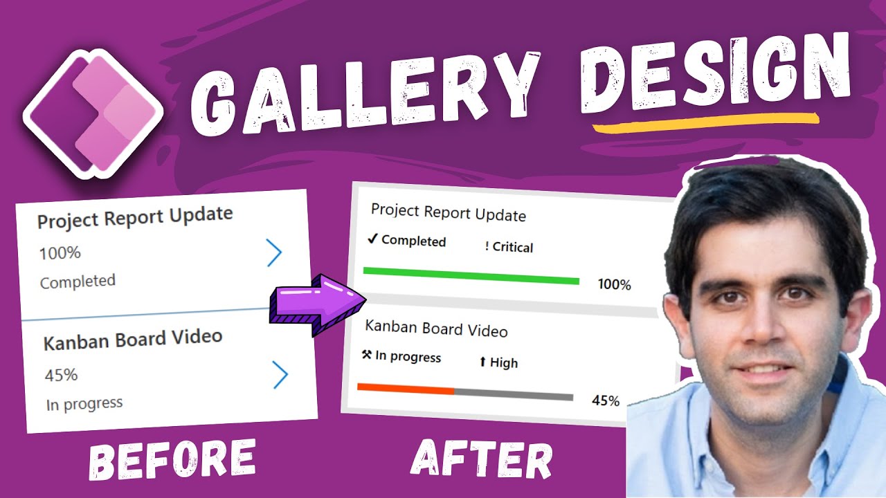
Power Apps Gallery Design Tutorial | Gallery UI styles
In this Power Apps design tutorial video, I will showcase how to transform the out of the box Gallery design (UI/UX) styles. We will improve the gallery design
In this Power Apps design tutorial video, I will showcase how to transform the out of the box Gallery design (UI/UX) styles. We will improve the gallery design by using out the box controls and properties (No usage of SVG or HTML controls).
We will create a card like gallery design using template padding, add mouse hover effect on gallery items (transition effect - push or pop), leverage buttons to set background color of items and create rounded corners using border radius, provide cursor hand mouse hover effect on all controls within gallery by superimposing a transparent button, show horizontal bar leveraging rectangle shape controls, use emojis, append text, conditional formatting, Apply dark and light themes to gallery styles, Change gallery colors using theme variables and more.
Power Apps Gallery Design Ideas:
https://www.youtube.com/watch?v=bnC8u3gdWss&t=0s
Gallery Lookbook Sample Data Set:
https://github.com/rdorrani/PowerApps/tree/master/Gallery%20Look%20Book
Table of Contents:
00:00 - Introduction to Gallery Designs in Power Apps
00:33 - Scenario/Example for Power Apps Gallery UI & gallery properties
01:31 - Gallery design (UI) power apps example
02:40 - Transform PowerApps gallery design step by step tutorial
03:41 - Set template padding for power apps gallery
04:08 - Hover effect for gallery items (transition - push or pop)
04:39 - Hover effect for power apps gallery items (cursor hand icon)
06:23 - Gallery scrollbar or navigation step
06:51 - Append text and emojis to gallery data
07:25 - Create SharePoint choice column "Choice Pills" like formatting using buttons
09:23 - Create horizontal bar in power apps gallery to display numeric data
11:17 - Power Apps Gallery UI design example walkthrough
12:01 - Conditional formatting in Power Apps galleries
12:24 - Change PowerApps gallery theme (styles/colors/UI) using variables (light mode and dark mode design)
13:44 - Power Apps Gallery UI design ideas
16:13 - Subscribe to Reza Dorrani channel
We value your privacy
This website stores data such as cookies to enable important website functions as well as marketing, personalization and analysis. You can change your settings at any time or accept the default settings. privacy policy.
