Create a Professional Excel Dashboard with Real Data
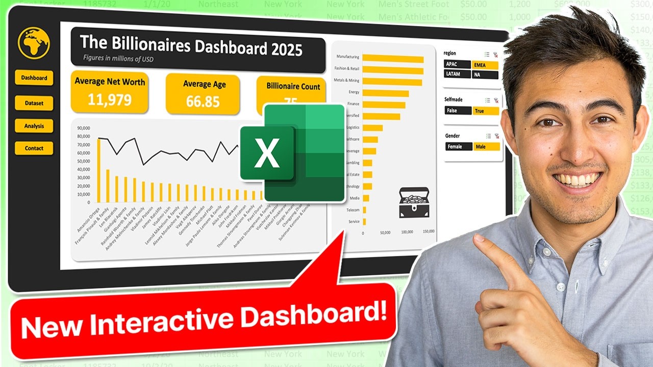
Create a dynamic Excel dashboard from scratch with real-world data in 20 minutes! Learn step-by-step with expert tips.
Key insights
- Data Preparation: Ensure your data is clean and organized before starting, removing duplicates and handling missing values.
- Import and Model: Use Excel's Power Query to import and transform data, enabling effective management of large datasets.
- Layout and Design: Plan the dashboard layout carefully, selecting key metrics, charts, and visuals to include.
- Interactive Elements: Add interactive features like slicers and timelines to allow dynamic data filtering.
- Finalization: Test the dashboard, refine as needed, and then share it with stakeholders for collaborative access.
Creating a professional Excel dashboard can be a game-changer for data visualization and decision-making. The process begins with data collection and cleanup, which is crucial for accurate insights. You then import and model data efficiently using Excel's powerful features. An effective layout and a balanced design are essential to ensure the dashboard communicates the right information effectively. Adding interactive features enhances usability, making the dashboard dynamic and user-friendly. Testing and refinement ensure its reliability. Once completed, sharing the dashboard can promote collaborative analysis. This systematic approach empowers users to uncover insights and make informed decisions with ease. Such dashboards are valuable tools for any organization looking to leverage data effectively.
Creating a Professional Excel Dashboard
This executive summary outlines the key techniques shared by Kenji Farré, known as Kenji Explains, in his comprehensive tutorial on building a professional dashboard using Excel. With his step-by-step guide, Kenji demonstrates how to transform raw data into an insightful dashboard, specifically focusing on the wealth of the world's richest individuals.
The video is segmented into clearly defined chapters: introduction to the workflow, data analysis, dashboard structuring, charting, and finally adding interactivity. The concise 20-minute YouTube demonstration provides a practical approach to mastering dashboard creation, a skill that Kenji has honed over years of experience.
Data Preparation and Importation
To begin, Kenji emphasizes the importance of collecting and preparing data meticulously. This involves ensuring data is clean by removing duplicates and addressing any missing values. Once cleaned, the data is imported into Excel, utilizing the Data tab to gather it from various sources such as CSV files, databases, or online services.
Transforming the data into a manageable data model using Excel's Power Query is the next crucial step. This model facilitates handling large datasets and establishing relationships between data tables, laying the groundwork for an efficient and organized dashboard.
Designing the Dashboard Structure
After data preparation, Kenji guides viewers through designing the dashboard layout. He advises planning which key metrics and visuals to feature, ensuring they are arranged logically to communicate the intended insights. The use of shapes and text boxes aids in structuring these components effectively.
Kenji then moves on to inserting visuals using Excel's robust charting capabilities. By accessing the Insert tab, users can choose from a variety of chart types such as bar charts, line charts, and pie charts, allowing customization to maintain the dashboard's cohesive theme.
Adding Interactivity and Finalizing
The final segment of Kenji's tutorial focuses on adding interactivity to the Excel dashboard. By incorporating elements like pivot table slicers and a navigation bar using hyperlinks, the dashboard becomes dynamic, enhancing user engagement.
Kenji also recommends utilizing Excel formulas and functions to create calculated fields, employing functions like SUM, AVERAGE, and VLOOKUP to further enrich data insights. Consistent formatting is crucial for a professional appearance, with careful application of colors, fonts, and borders to improve readability.
Testing the dashboard with real users and refining it based on feedback ensures accuracy and usability. Once complete, the dashboard can be saved, shared, and even published online for collaborative access, thus effectively serving its purpose to communicate data insights comprehensively.
General Insights on Dashboard Creation
This YouTube video highlights the intricate process of creating a professional-grade dashboard using Excel. Kenji Farré’s detailed tutorial reveals the importance of starting with clean and well-organized data, which can then be skillfully structured and visually represented using Excel's tools. By incorporating interactive features, such dashboards empower users to explore data dynamically, offering a customizable view of insights.
Kenji's approach underscores the essential role of formulas and functions in deriving actionable insights. Additionally, his emphasis on user feedback demonstrates the value of refining dashboards to meet specific needs, ensuring clarity and effectiveness. This thorough method transforms basic data presentation into a powerful tool for decision-making and strategy development.
The tutorial encourages leveraging Excel's capabilities beyond traditional data handling, showcasing its potential as a versatile tool for business intelligence and analytics. Mastering such techniques can enhance productivity and enable clearer communication of complex data sets.
![]()
People also ask
"How do I create a quality dashboard in Excel?"
Answer: To start building a quality dashboard, it's crucial to first understand the essentials. This foundation will guide the design and functionality of your dashboard to ensure it meets user needs and expectations effectively."How do I create real time data in Excel?"
Answer: To incorporate real-time data into Excel, you'll need to establish a connection that enables live updates. This setup involves linking data sources that support real-time capabilities, ensuring your spreadsheet is consistently up to date."How to create a dynamic dashboard in Excel?"
Answer: Building a dynamic dashboard in Excel can be achieved by following a structured approach. Typically, this involves eight simple steps that cover data preparation, visualization, and interactivity, resulting in a responsive dashboard experience."How do I create a performance dashboard in Excel?"
Answer: To develop a performance dashboard using Excel, follow these six essential steps to effectively translate data into actionable insights. Each step guides you through the process of collecting, organizing, and displaying key performance metrics efficiently.
Keywords
Professional Excel Dashboard, Excel Dashboard Tutorial, Real-World Data Excel, Excel Dashboard Design, Data Visualization Excel, Create Excel Dashboard, Excel Analytics Dashboard, Advanced Excel Techniques
