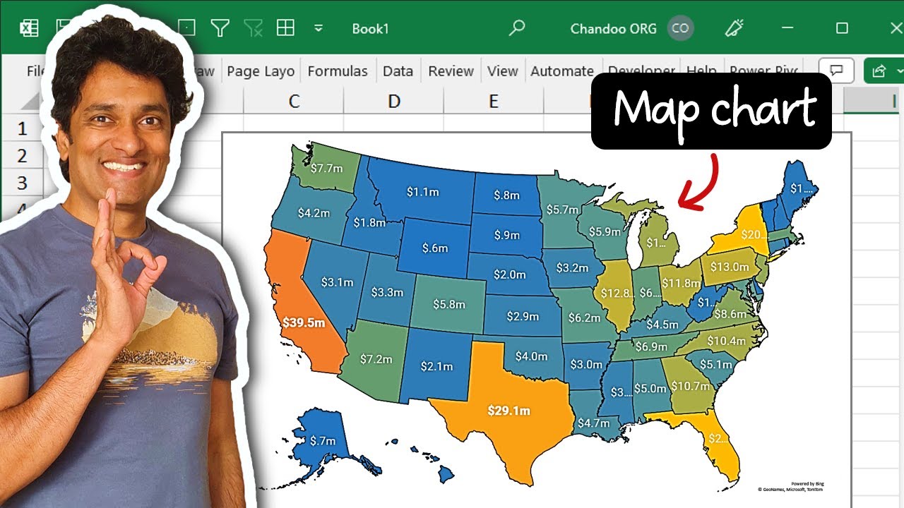
How to make Map Charts in Excel
You can create easy and powerful map charts in Excel
In Excel, you can create map charts to display geographical data. The map chart feature uses Bing Maps and allows you to convert geographic data into a visual map.
1) Select your data (geographical column and some numeric column)
2) Go to Insert Ribbon and click on Maps → Filled Map
3) There is no step 3. Your map is ready!
Get the sample file and more from here 👉
[https://chandoo.org/wp/interactive-map-chart-in-excel/]
Here's how you can make map charts in Excel:
1. Prepare your data:
For your map to be accurate, you need to make sure your data is in a format that Excel can understand. Your data should have geographical categories (like countries, states, etc.) in one column and numerical values in another column.
For instance:
Column A: United States, Canada, Mexico
Column B: 300, 400, 500
2. Select your data:
Select the cells that contain the geographical data and the corresponding numerical data.
3. Insert a Map Chart:
From the Excel Ribbon, select Insert, then in the Charts group, select the Maps dropdown. Then, select Filled Map.
Note: If you don't see the Maps group, your version of Excel might not have map charts. As of the last update in 2021, map charts are available in Excel 2016 and later versions.
4. Customize your Map Chart:
Once you've inserted the map chart, you can customize it to suit your needs. To do so:
- Select the map.
- Use the
Chart Toolsin the Excel Ribbon. UnderDesign, you can selectChart Stylesto change the look of the map. - Under
Format, you can adjust elements like chart area, plot area, etc.
You can also add a chart title by clicking on the chart and then selecting Chart Tools > Design > Add Chart Element > Chart Title.
5. Adjust the Map Projection:
If you want to change the view of your map, you can adjust the map projection. Just select the chart, go to Chart Tools > Format > Map Projection, and then choose from the available options.
Remember to double-check your data to ensure accuracy and make sure your chart is displaying the information you want to convey clearly. Happy charting!
