
5 Expert Tricks to Create Excel Bar Graphs Like a Pro
Master Excel Bar Graphs: 5 Advanced Tricks to Excel - Watch Now!
Key insights
- Learn professional bar graph creation in Excel with an easy-to-follow tutorial and expert tricks.
- Access a sample file for practice to enhance your data visualization skills effectively.
- Discover tips on fixing category order, sorting items by value, and creating beautiful, functional charts.
- Learn how to highlight the best values automatically and add meaningful titles and labels to your charts.
- Find out about a unique trick for creating an image chart in Excel, making your data presentation stand out.
Exploring Excel Expertise for Enhanced Data Visualization
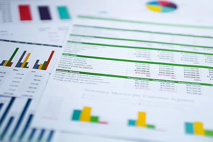
Excel is not just about number crunching; it's a powerful tool for visualizing data in a way that can reveal insightful patterns and trends. Crafting a bar graph in Excel like a professional entails understanding not just the basics of chart creation, but also mastering several tricks and techniques that can transform a standard chart into a compelling data story. Whether it’s through rectifying the order of categories, sorting chart items by value, or adding aesthetic flair, each enhancement serves to make the graphical representation of data more intuitive and impactful.
Excel Bar Graph Mastery: 5 Pro Tips
Unlock your data visualization potential with Chandoo's latest YouTube video, guiding you on how to create a professional bar graph in Excel. This comprehensive tutorial is perfect for both beginners and those aiming to boost their skills in Excel. By watching this video, you'll not only learn the basics but also discover five expert tricks to enhance your bar graph presentations.
For those seeking hands-on experience, Chandoo provides a sample file available for download. This allows viewers to practice the demonstrated techniques and solidify their understanding of creating visually appealing bar graphs.
Video Breakdown
- Introduction to creating a bar chart in Excel.
- Tips on ordering categories in a bar graph for better clarity.
- Guidance on sorting bar chart items according to their values.
- Techniques to beautify bar charts and make them presentation-ready.
- Strategies for comparing month-on-month values using bar charts.
- Instructions on how to automatically highlight the best value in a graph.
- Steps to add meaningful titles and labels for reader understanding.
- Revealing a unique method of creating image charts within Excel for an added wow factor.
Further Learning Options
For individuals eager to expand their Excel expertise, Chandoo has curated a series of tutorials ranging from basic to pro levels. Topics include creating dropdowns, using slicers, understanding references, and mastering pivot tables. These resources are available in the Excel Basics to PRO Playlist, ensuring a well-rounded learning journey.
Moreover, Chandoo invites viewers to join his Excel School program. This award-winning course promises to significantly improve your Excel abilities in a short timeframe, positioning you to excel in your workplace.
Enhancing Excel Skills for Effective Data Visualization
Data visualization in Excel is an essential skill for anyone dealing with data analysis and presentation. Excel offers a versatile platform for creating bar graphs that not only represent data accurately but also appeal visually to viewers. The key to mastery lies in understanding the variety of tools and features Excel provides, such as sorting data, applying conditional formatting, and utilizing advanced chart features.
Creating effective bar graphs involves more than just selecting data and choosing a chart type. It requires an understanding of how to best represent the data, highlight key insights, and make the graph accessible and understandable to its audience. The ability to customize the look and feel of the graph, including its colors, labels, and titles, plays a significant role in its overall effectiveness.
The tips shared by Chandoo go beyond basic chart creation, offering insights into professional-level techniques that enhance the storytelling ability of your graphs. From sorting items to highlight comparisons between categories to jazzing up your charts with image fills, these advanced strategies show how Excel's simple bar graph tool can be transformed into a powerful data visualization instrument.
People also ask
Questions and Answers about Power Platform/Power BI
"How do I make my Excel bar graph look professional?" Answer: "There are eight carefully outlined steps to enhance the professionalism of your Excel bar chart which involves specific steps and settings adjustment within Excel." "How do you make a bar graph with 5 variables in Excel?" Answer: "Creating a bar chart in Excel to display multiple variables requires a sequence of steps: inputting your data, selecting the appropriate data range, deciding on the bar chart variant, utilizing the “Chart Design” tab under “Data” to adjust rows and columns, and finally saving or exporting your work." "How do you make an advanced bar graph in Excel?" Answer: "To construct a sophisticated bar graph in Excel, initiate by entering the necessary data in an Excel sheet. Then, select the data and proceed to the 'Insert' menu to choose from various chart and graph options that best represent your data. You will be presented with a range of chart types to refine your selection." "How do I make an Excel graph more professional?" Answer: "To enhance the professionalism of an Excel graph, it's crucial to follow specific formatting guidelines that are widely accepted within the professional finance community for graph presentation."
Keywords
Excel bar graph, create bar chart Excel, advanced Excel bar graph tricks, professional Excel chart tips, Excel graph tutorial, bar chart design Excel, Excel data visualization, improve Excel chart skills