Excel
Sep 10, 2022 2:43 PM
Build the ULTIMATE Excel Dashboard from Scratch
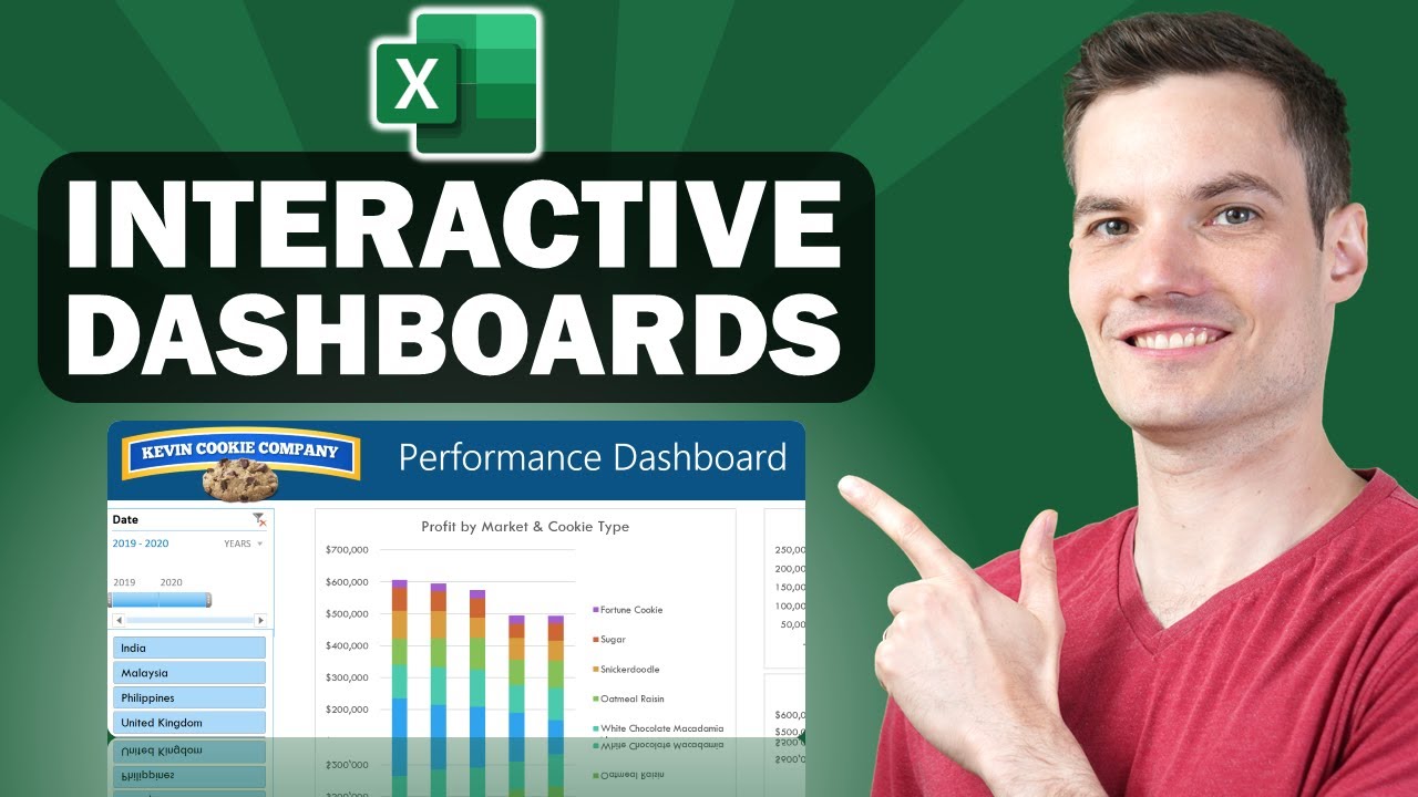
Build an interactive Excel dashboard from scratch using pivot tables.
In this tutorial, it is shown to you how to use Excel to construct an interactive sales dashboard for Adidas that will dynamically change according on the filters you choose from the side.
To show us the relevant facts, we will first review the dataset and generate pivot tables. Second, we'll design the dashboard's appropriate charts and graphics.
The real dashboard's design will then start from scratch.
Finally, we'll assemble everything into an interactive dashboard by dynamically combining the graphics.
In this video:
- 0:00 - Pivot Table Analysis & Charts
- 6:52 - Designing the Dashboard
- 11:31 - Table format & Sparklines
- 16:19 - Making the Dashboard Dynamic
Download the Excel Sheet
https://view.flodesk.com/pages/62e6c1afc4d48aec3664b8e4
More about Excel in the News Center
HubSite 365 Apps
