Create Excel Budget vs. Actuals Chart with Variance Analysis
Master Excel: Creating Dynamic Budget vs Actuals Charts with Variance Analysis!
Key insights
- Budget vs actuals chart in Excel with variance is not readily available, but can be achieved through a combination of techniques.
- Creating a combo chart and modifying the line to show only markers enhances visual representation of data.
- Adding data labels that reflect the variance for each budget amount provides clarity and precise information.
- Learning how to make a chart auto expand by using 'Format as Table' feature optimizes the dynamic use of data ranges.
- Cleaning up the chart after adjustments is essential for maintaining a professional and organized presentation.
Exploring Excel's Capabilities for Budget Analysis
Creating a budget vs actuals chart in Excel involves innovative use of the software's charting functionality since Excel does not provide a built-in solution for this specific comparison.
Users need to manually tweak standard charts to serve their purpose. This demand has led to the evolution of how users interact with Excel, pushing beyond basic functionalities to customize detailed financial reports. Techniques such as adjusting chart elements and adding variance data labels allow for enhanced data visualization and analysis. Moreover, making a chart automatically adapt to added data via Table formatting proves Excel's capability to handle dynamic datasets efficiently. These methods profoundly enhance user engagement with the tool, adding value to financial reporting and analysis in various business environments.
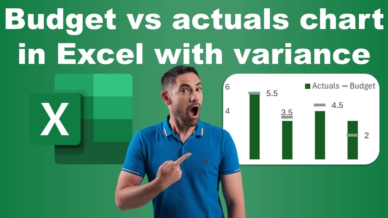
In a recent YouTube presentation by David Benaim, viewers learn how to create a budget versus actuals chart with variance analysis in Excel. Initially, he explains that Excel does not provide a built-in chart for such needs. However, with some creative workarounds, it is quite feasible to achieve this. Benaim introduces the concept of a combo chart, where line charts are manipulated to show only markers without the connecting lines.
The tutorial further elaborates on enhancing the visualization of data. Adding data labels directly to these markers allows viewers to easily see the variance by each budget amount. This method provides a clear, immediate visual representation of the data, distinguishing between planned and actual figures effectively. This part of the presentation focuses on practical instructions and visual tweaks to better represent the fiscal comparison.
Another significant feature discussed is making a chart that can auto expand in spreadsheet software. This function is pivotal for dynamic datasets that frequently update. By formatting the data range as a table, the chart automatically adjusts as new data points are added, maintaining the chart's accuracy over time. This advanced feature is particularly useful for ongoing projects or continuous financial tracking.
- Creating combo charts in Excel for detailed budget analysis.
- Enhancement techniques like the addition of data labels for better visualization.
- Setting up self-adjusting charts to accommodate dynamically changing datasets.
The information provided by David Benaim offers valuable insights into managing financial data more effectively in Excel. These techniques not only improve the aesthetic appeal of the charts but also increase their functionality and ease of interpretation. It's clear that with a bit of ingenuity, Excel can be an even more powerful tool in the arsenal of anyone managing budget data.

People also ask
## Questions and Answers about Microsoft 365"How to calculate actual vs budget variance in Excel?"
Answer: "In Excel, create a new column where you subtract the actual values (Column C) from the budgeted values (Column B) using the formula =B2-C2 for the first row. Drag this formula across the column to compute variance for all entries.""How to show a variance in an Excel chart?"
Answer: "To demonstrate variance in a chart, use the VAR.S function. For instance, using =VAR.S(B12:B32) calculates the variance of data from cells B12 to B32.""How do you graph budget vs actual in Excel?"
Answer: "Creating a budget vs actual graph in Excel is straightforward and efficient.""What is the best chart for variance analysis?"
Answer: "The waterfall chart is highly recommended for conducting variance analysis as it clearly depicts how actual results compare against budgeted figures or how figures have changed from a baseline.""How to make a planned vs actual graph in Excel?"
Answer: "To effectively display planned versus actual data, utilizing a method detailed in the video by 'dptutorials' can be very helpful.""How to show budget variance?"
Answer: "To display budget variance, compute the percentage by dividing the variance by the budgeted figure and then multiply by 100. A positive outcome indicates favorable variance, whereas a negative value shows an unfavorable variance."
Keywords
budget vs actuals Excel, Excel variance chart, budget actuals comparison chart, financial variance analysis Excel, budget forecasting Excel, actual vs forecast Excel template, budget tracking in Excel, performance budgeting Excel.
