- All of Microsoft
Optimize Power BI Visuals: Quick & Effective Tips
Revamp Your Power BI Visuals with Bookmarks and Navigation Buttons!
Key insights
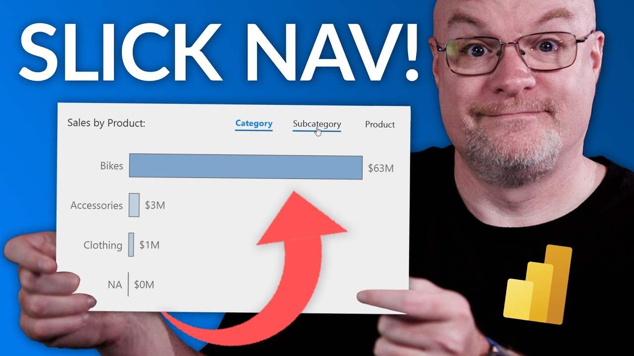
Learn how to create a slick way to adjust your Power BI visual using bookations and a Navigation button.
Guy in a Cube provides training courses to help enhance your Power BI skills.
Connect with Guy in a Cube through multiple social media platforms for more insights and updates.
Explore tools and resources on the Guy in a Cube website to aid in your Power BI projects.
Adam from Guy in a Cube offers a visual guide to improve the look and functionality of your Power BI reports.
Exploring Power BI Enhancements with Guy in a Cube
Power BI, a powerful data visualization tool, empowers users to consolidate data from various sources and create insightful visual representations. Guy in a Cube, a popular platform run by Adam, provides valuable content to help both beginners and seasoned professionals elevate their understanding and capabilities with Power BI. The Guy in a Cube YouTube channel specifically helps users by demonstrating practical applications such as adjusting visuals using bookmarks and navigation buttons. This slick technique not only enhances the look but also the functionality, making reports more interactive and easier to navigate. With an array of training courses, tools, and social media connections, Guy in a Cube is a go-to resource for anyone looking to advance their proficiency in Power BI.
In a recent youTube video by Guy in a Cube, the presenter, Adam, shares valuable insights on enhancing visuals in Power BI. Adam demonstrates a stylish method to customize visuals using bookmarks and navigation buttons. This technique is intended to streamline user engagement and improve the aesthetic of reports.
The video succinctly covers the foundational steps on setting up bookmarks. This tool within Power BI allows users to save the current state of a report page, making it easier to return to a specific configuration of filters, slicers, and visibility settings. Adam illustrates how bookmarks can create dynamic, interactive reports that are more compelling to the user.
Additionally, Adam touches on the use of navigation buttons in Power BI, a feature that enhances the interactive component of reports. These buttons can guide users through different views and insights, effectively making the data narrative more engaging. With this, reports are not just informative but also intuitive to users at different levels of data literacy.
- Introduction to bookmark features in Power BI.
- Steps to integrate and customize bookmarks within a report.
- Utilizing navigation buttons to enhance user experience.
Moreover, the video mentions that for users eager to advance their skills with this Microsoft tool, there are comprehensive training courses offered by Guy in a Cube. Explore Power BI courses.
These courses promise to delve deeper into not only the technical skills required to use Power BI effectively but also into strategies that can make the analytics more impactful. They are designed for users who wish to elevate their data storytelling capabilities, leveraging advanced features of Power B...

People also ask
How do I make my Power BI chart look better?
"Opt for a uniform color scheme and font choice, utilize alignment tools to format multiple visuals simultaneously, incorporate icons and buttons, and maintain simplicity in your dashboard design. These strategies will enhance the professionalism and visual appeal of your dashboard, making it a more effective communication tool for your data."How to customize the look and feel of the visualization in Power BI?
"To begin customizing a visual in Power BI, first make sure it is active. Click on the paintbrush icon to open the Formatting pane. This pane will show all available formatting options for the visual in focus. Click on 'Colors' to see the customization options available for colors."How do I improve visual performance in Power BI?
"Enhance report performance in Power BI."How do I create a custom visual in Power BI?
"Process for Developing Custom Visuals:"Keywords
Power BI custom visuals, Power BI design tips, Enhance Power BI reports, Customize Power BI dashboard, Power BI visualization techniques, Advanced Power BI guide, Improve Power BI visuals, Power BI tutorial
