- All of Microsoft
Create SVG Donut Chart Matrix with Percentages in Power BI
Learn to Build a Donut Chart Matrix Using SVG in Power BI: Essential Tips for Beginners.
Key insights
- Create a donut chart matrix visualizing percentages using SVG in Power BI.
- Modify Harveyball SVG charts to add dynamic visual elements and color updates.
- Include text descriptions and fix saturation issues within the chart for improved legibility.
- Fernan, founder of Solutions Abroad, offers free educational content on Power BI, complemented by paid courses and templates.
- Engage with the community through newsletters, social media, and various support options like Patreon.
Exploring Power BI with Donut Chart Matrices
Create a Donut Chart Matrix Using SVG in Power BI
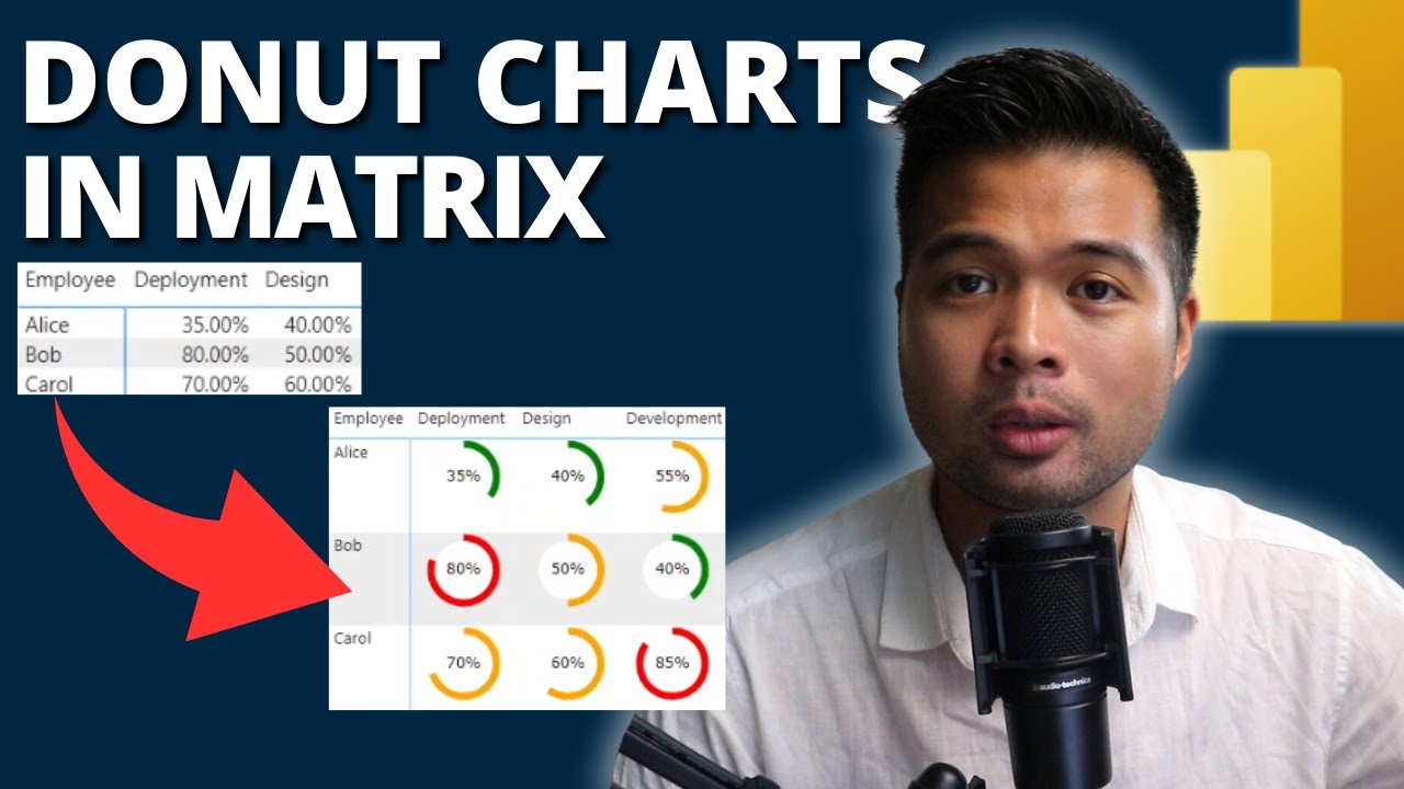
In a recent YouTube video by Fernan Espejo of Solutions Abroad, viewers are guided through the process of modifying Harveyball SVG solutions to create a matrix that visualizes donut charts with percentages in Power BI. This tutorial targets beginners and helps them understand the intricacies of creating engaging visuals with data.
The video begins with an introduction to the basics of SVG graphics within the context of Power BI. Fernan emphasizes the flexibility and visual appeal that SVGs bring to data presentations, enhancing the interpretability and attractiveness of information displayed.
Video Walkthrough and Modifications
Fernan provides a step-by-step guide starting with the Harveyball chart, then moving onto how to adjust the SVG code to better suit individual project needs. Key adjustments include updating colors to match corporate branding, and adding text labels for clearer communication.
The tutorial progresses to more advanced modifications such as fixing the '100% bar' issue often encountered in SVG visual integrations. These detailed guides ensure even beginners can follow along and apply these tips to their own Power BI projects with ease.
Additional Resources and Support
To support learning, Fernan provides links to demo files, essential for those who wish to practice the skills taught. While direct links to external resources were mentioned, viewers are encouraged to visit the Solutions Abroad channel for downloads and further instructions.
Furthermore, the video encourages viewers to engage with additional resources such as free newsletters for regular updates in Power BI, and premium content like specialized templates and courses for further learning.
This educational content not only boosts the viewer's ability to create powerful data visualizations but also integrates community support and additional learning resources, making it a rounded tutorial for anyone looking to enhance their skills in Power BI.
Exploring Data Visualization in Power BI
Data visualization is a critical aspect of business intelligence that allows professionals to convert raw data into understandable and actionable insights. Power BI provides an extensive suite of tools that help in visualizing and analyzing data efficiently. Tools like SVG integration allow for customized, flexible visual representations, enhancing the analysis and presentation processes.
The use of donut charts, a variant visualized in the discussed video, is prevalent in many business scenarios due to their effectiveness in showing proportions in a dataset. When combined with Power BI's analytics capabilities, they serve as a powerful tool for delivering insights.
As businesses continue to generate vast amounts of data, the need for effective data visualization tools becomes increasingly crucial. Power BI, with its robust features like drag-and-drop simplicity and quick insights, provides a competitive edge by enabling users to create insightful, interactive reports and dashboards.
The educational content provided by experts like Fernan Espejo on platforms such as YouTube helps democratize the knowledge of these tools, making advanced data handling accessible to a broader audience. This not only fosters a data-informed culture across various sectors but also empowers individuals with the skills to harness the potential of big data.
With continuous updates and community-driven enhancements, Power BI is evolving, and tutorials that bridge the gap between technical potential and user capability are invaluable. They help users not just in mastering the software but also in understanding how it can be tailored to fit various data needs and contexts.
Solutions Abroad, under Fernan’s guidance, aims to support the growth of data enthusiasts, enabling them to elevate their analytic skills in Power BI and beyond. Such initiatives significantly contribute to the spread of knowledge and expertise in the field of business intelligence, fostering a well-informed and capable professional community.
Developer Tools Teams Planner Power BI Power Automate

People also ask
"How to create a donut chart on Power BI?"
To create a donut chart in Power BI, begin by loading your dataset into the Power BI environment. From there, select the ‘Donut chart’ visualization option from the Visualizations pane. Drag and drop the desired fields onto the Values and Legend sections to populate the chart. Adjust formatting as needed to enhance visual appeal.
"How to show percentages in Power BI charts?"
To display percentages in Power BI charts, first ensure your data includes a percentage field or calculate it in a DAX formula. Select your chart, then drag the percentage field onto the appropriate values area in the visualization pane. You can format these values as percentages via the Format panel under the ‘Data label’ section.
"How to use SVG in Power BI?"
To incorporate SVG images in your Power BI reports, use the HTML Viewer custom visual from the marketplace. You can then write HTML code that includes your SVG content within a measure, and display this measure using the HTML Viewer visual.
"How do you show value as percentage in Power BI format?"
To format a value as a percentage in Power BI, you need to use a DAX formula to create a calculated column or measure that computes the value as a percentage. Subsequently, you can adjust the format of your calculated measure or column to display as a percentage through the Modeling tab by selecting the 'Percentage' format option.
Keywords
Power BI Donut Chart, SVG Power BI, Create Donut Chart, Power BI Percentages, Power BI Beginners Guide, Power BI SVG Tutorial, Donut Chart Matrix Power BI, Visualize Data Power BI
