- All of Microsoft
Converting an App to Responsive in Microsoft Power Apps
Converting an App to Responsive in Microsoft Power Apps involves several steps essential for catering to various device sizes and orientations.
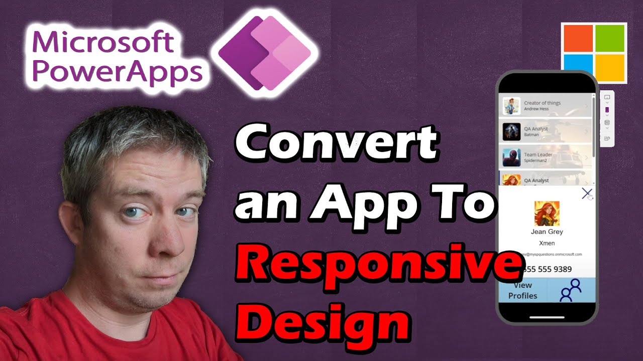
Converting an App to Responsive in Microsoft Power Apps involves several steps essential for catering to various device sizes and orientations. Citizen developers often need to convert non-responsive apps to a Responsive Power App Design. The process begins by starting a brand new app and configuring settings like locking aspect ratio and scaling to fit.
- Introduction (0:00)
- Starting a Brand New App (1:11)
- Lock Aspect Ratio and Scale to fit (4:00)
- Convert a Button into an Icon (7:45)
- Finding the Exact Width of a Device (9:48)
- Adding Backgrounds (11:50)
- Making a Gallery Responsive on Screen2 (14:10)
- Making a Form Responsive on Screen3 (17:50)
- WidthFit something I learned New (19:25)
- Conclusion (21:30)
Throughout the process, various tasks like converting buttons into icons and finding the exact width of a device are undertaken. Then, backgrounds are added and individual screens like a gallery and form are made responsive. A new property called WidthFit can also be utilized to enhance the responsiveness of the app.
Microsoft Power Apps is a suite of tools, apps, and services for rapid application development. To convert an existing app to be responsive, there are a few steps you can take:
Use Relative Positioning and Sizes: You should avoid using fixed sizes and positions for your controls. Instead, use formulas that reference the Width and Height properties of the screen or other controls.
Use the Flexible Height Gallery: This is a type of gallery control that adjusts its height based on its content. This is useful for sections of your app that might have varying amounts of content.
Use the Scrollable Screen: This is a type of screen that allows for vertical scrolling. This is useful for forms or other sections of your app with a lot of content.
Use the Aspect Ratio Property: This is a property of images and other controls that allows them to maintain their aspect ratio as the screen size changes. This is useful for images and other controls that need to maintain their shape.
Test on Different Screen Sizes: You should always test your app on a variety of screen sizes to ensure it looks and functions as expected.
These are general guidelines and the exact steps may vary based on your specific app and requirements. Remember that the goal is to ensure that your app provides a good user experience on all screen sizes.
Responsive Power App Design for Better User Experience
Creating responsive Power Apps is essential for providing improved user experience on various devices and screen sizes. Converting an app to a responsive design involves adjusting settings, introducing dynamic widths, and using properties like WidthFit, all while keeping the app's functionality intact. By doing so, citizen developers can ensure that their apps cater to their diverse user base and deliver an optimal experience across different devices.
Learn about Converting an App to Responsive in Microsoft Power Apps
Converting an App to Responsive in Microsoft Power Apps is a great way to make sure your app looks great no matter what device it is being viewed on. The process of converting an app to responsive design involves making changes to the app's layout, like adjusting the size of the elements, locking the aspect ratio, and scaling to fit. It also involves changing buttons to icons, adding backgrounds, and making the gallery and form responsive. One new property of the form, called WidthFit, is also introduced. In order to complete this process, it is important to know the exact width of the device the app is being viewed on. With all of these changes, the app will be optimized for any device and look great on any screen.
The process of converting an app to responsive design does not need to be hard. By following the steps outlined in the video, you can easily make your app look great on any device. Starting with a brand new app is often the best way to get started, as it will make the process much more straightforward. From there, you can make the necessary changes to the layout, such as adjusting the size of the elements, and then you can move on to changing buttons to icons and adding backgrounds. Finally, you can make the gallery and form responsive, and learn the new WidthFit property. With the help of this guide, you will be able to make sure your app looks great no matter what device it is being viewed on.
More links on about Converting an App to Responsive in Microsoft Power Apps
- Create responsive layouts in canvas apps - Power Apps
- Dec 15, 2022 — To make your app's layouts respond to changes in the screen dimensions, you'll write formulas that use the Width and Height properties of the ...
- Building Responsive PowerApps for Canvas Apps
- Aug 11, 2020 — The very first step in creating the app is to select which form you would like the app for (in addition to the web) – mobile or tablet. This was ...
- Turning off Scale To Fit Doubles Pixel Density
- Turning off Scale To Fit Doubles Pixel Density ... I'm experimenting with Responsive Canvas apps (following https://docs.microsoft.com/en-us/powerapps/maker/ ...
Keywords
Microsoft Power Apps, Responsive Design, Citizen Developer, Lock Aspect Ratio, Icon Conversion, Device Width, Backgrounds, Gallery Responsive, Form Responsive, WidthFit
