Data Analytics
- All of Microsoft
Zeitspanne
explore our new search
Power BI
17. Dez 2024 20:27
Power BI: Create Interactive Flip Employee Cards in Just 3 Minutes!
Power BI, Power BI Desktop, DAX
Key insights
- Data Card: A visual element in Power BI used to display a single value such as sum, average, count, maximum, minimum, or calculated measures like revenue or sales. It's ideal for showcasing summary-level information.
- Card Visual Location: Found in the Visualizations Pane in Power BI Desktop or Service. Selecting the card icon adds it to your canvas for easy data representation.
- Key Features of Data Cards: They display a single aggregated value with customizable formatting options including text size, font, color, background, and borders. They dynamically update based on filters and data refreshes.
- Creating a Card Visual: Add data by dragging a numerical field to the card visual. Customize aggregation methods such as sum or average through the field's drop-down menu. Use the Format Pane for visual adjustments.
- Power BI Report Launch Process: Includes KPI discovery workshops and stakeholder engagement to transform descriptive data into actionable visuals. It involves report development with custom layouts and UX elements for user adoption.
- User and Developer Training: Focused training sessions ensure understanding of technical details for maintaining reports. Online self-paced user training is available with optional custom recordings for enhanced learning.
Introduction to Power BI's Flip Employee Card Feature
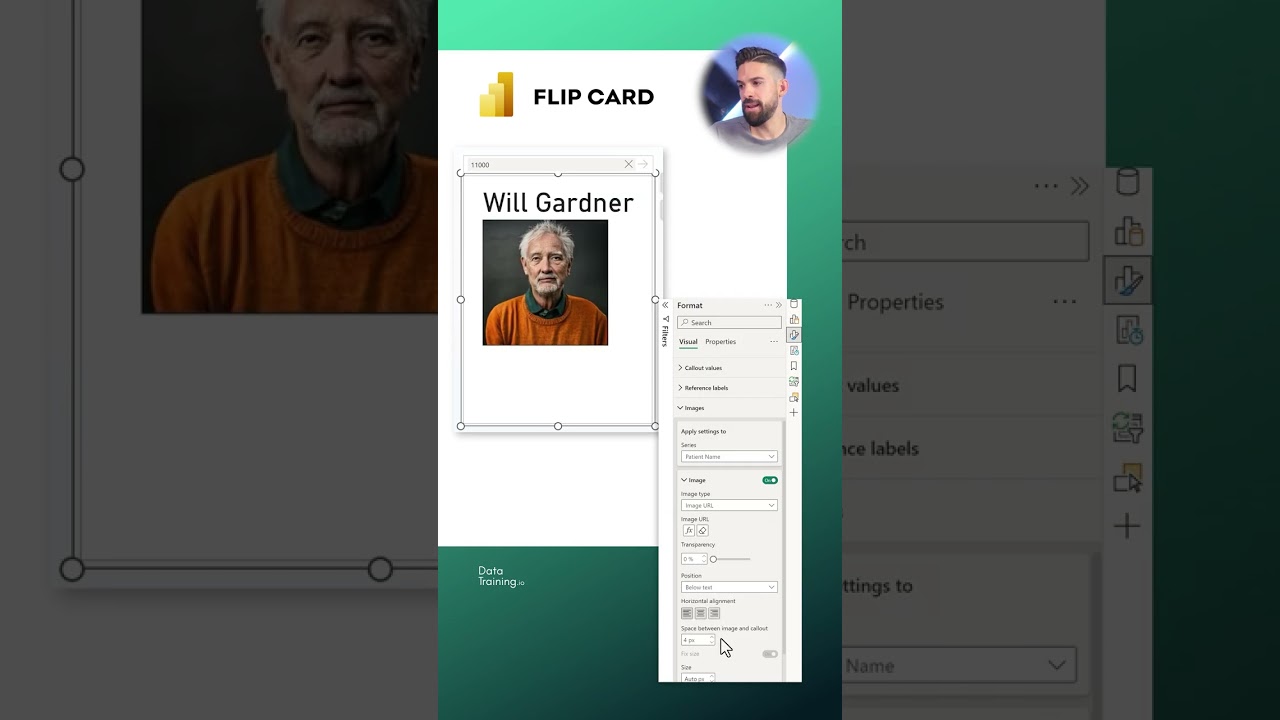
Power BI has become an essential tool for data visualization and business intelligence. The YouTube channel "How to Power BI" recently released a video showcasing a feature that allows users to create a flip employee card in Power BI in under three minutes. This feature is part of the broader Power BI Transformation initiative, which aims to enhance user experience and efficiency. In this article, we will explore the details of this feature, its benefits, and the challenges involved in implementing it effectively.Understanding Data Cards in Power BI
Data cards are a fundamental component of Power BI, used to display single values such as sums, averages, counts, or calculated measures like revenue or sales count. These cards are straightforward and provide a clean way to present summary-level information. Users can find the card visual in the Visualizations Pane of Power BI Desktop or the Power BI Service. By selecting the card icon, users can add a visual card to their canvas, making it easy to showcase key metrics.Key Features and Customization Options
One of the main advantages of data cards is their ability to display a single aggregated value, which can be customized in various ways. Users can adjust text size, font, color, background, and borders to match their specific needs. Additionally, data cards are dynamic, meaning they automatically update based on filters, slicers, or data refreshes. This adaptability ensures that the information displayed is always current and relevant, which is crucial for making informed decisions.Creating and Formatting a Card Visual
To create a card visual, users need to drag a numerical field, such as Sales Amount, from the Fields pane to the Card visual. By default, Power BI aggregates numerical values as a sum, but users can change this to average, count, or other options by clicking the drop-down menu on the field. Once the data is added, users can format the card using the Format Pane to adjust visuals such as background, title, and text alignment. This level of customization allows for a tailored presentation of data that aligns with the user’s objectives.The Importance of a Structured Power BI Report Launch
Launching a Power BI report effectively requires careful planning and execution. The process involves several steps, including KPI Discovery and Requirements workshops, report development, and stakeholder engagement. These steps ensure that the report serves a formulated decision purpose and provides value to end users. Moreover, training for developers and users is crucial for maintaining the report and ensuring user adoption. Skipping these steps can lead to incomplete insights and inefficient reporting, which can hinder decision-making and reduce return on investment.Challenges and Tradeoffs in Power BI Implementation
While Power BI offers powerful tools for data visualization, implementing these features can present challenges. Balancing technical expertise with stakeholder management is essential for a successful report launch. Additionally, the need for ongoing maintenance and updates requires a commitment to continuous improvement. Users must weigh the benefits of customization and dynamic data against the complexity of setup and maintenance. However, with the right approach, Power BI can provide a user-friendly and impactful platform for data-driven success. In conclusion, the flip employee card feature in Power BI exemplifies the platform's potential to enhance data visualization and reporting. By understanding the fundamentals of data cards and following a structured approach to report development, users can unlock the full potential of Power BI. Despite the challenges involved, the benefits of a well-executed Power BI implementation are significant, offering valuable insights and supporting informed decision-making.

Keywords
FLIP EMPLOYEE CARD, Power BI tutorial, quick Power BI tips, employee card visualization, Power BI dashboard tricks, data visualization techniques, fast Power BI guide, interactive reports in Power BI
