- All of Microsoft
Create Stunning Waffle Charts Easily in Power BI
Master Power BI Waffle Charts: Easy, Engaging Visual Guide!
Key insights
- Learn how to create visually appealing and informative waffle charts in Power BI with a step-by-step guide.
- Waffle charts effectively display percentage data in an easy-to-understand grid format, enhancing clarity at-a-glance.
- This tutorial includes instructions on importing custom visuals, configuring data, and chart formatting for optimal clarity.
- Access additional learning resources such as Power BI courses at curbal.com to enhance your expertise in the tool.
- Interact and extend your learning through channel memberships, playlists, and engaging with the content creator on various platforms.
Understanding Waffle Charts in Power BI
Waffle charts in Power BI are specialized visuals used for presenting percentage-based data. Unlike more complex chart types, waffle charts utilize a simple grid arrangement where each cell represents a fraction of the total, making it extremely intuitive to understand the data's proportions instantly. As part of Power BI's extensive visualization toolkit, these charts help in conveying data points quickly and effectively, crucial for decision-making in business contexts.
Moreover, with the help of Power BI’s robust functionalities, users can easily import customized visuals and adjust configurations to meet specific presentation needs, thereby enhancing the overall impact of the data presented. Importing such visuals and configuring them rightly is critical in achieving the desired readability and information clarity, which the tutorial aims to teach effectively. Power BI continues to be a powerful tool for business intelligence, and mastering chart types like waffle charts is an asset for any data professional.
Furthermore, learning resources such as online tutorials, courses, and community memberships offered by platforms like Curbal can significantly help users by providing easy access to necessary skills and knowledge, enriching their data visualization capabilities and advancing their proficiency in utilizing Power BI.
Introduction to Waffle Charts in Power BI
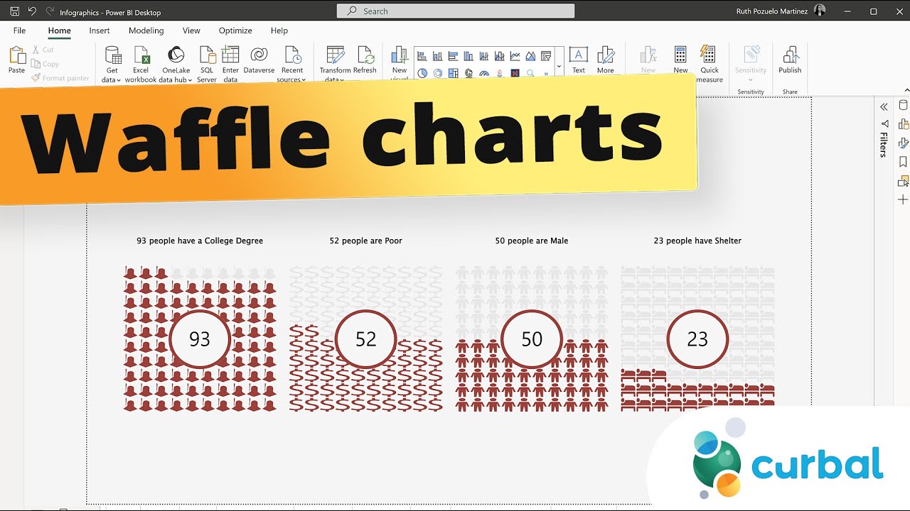
This video by Curbal introduces viewers to creating visually engaging waffle charts using Power BI. The tutorial is designed to be easy to follow, explaining each step in the creation process from importing visuals to fine-tuning the final appearance of the chart. Waffle charts are especially useful for displaying percentage data effectively.
Step-by-Step Guide
The tutorial begins with a basic introduction to waffle charts, explaining their purpose and advantage in presenting data. It then guides the viewers through the process of accessing and importing the necessary custom visuals into Power BI. The emphasis is on ensuring that even beginners can follow the steps smoothly.
Data Configuration and Chart Formatting
Once the visuals are imported, the tutorial covers how to configure data sources and adjust the settings to display the data correctly in the waffle chart format. It also provides tips on formatting the chart to enhance readability and visual appeal. This allows for the creation of a chart that is not only informative but also pleasing to the eye.
Additional Resources and Learning Avenues
Beyond the tutorial, Curbal encourages viewers to join the channel for further learning and access to new content as it becomes available. They also offer access to downloadable files to practice the taught concepts. The video also mentions other resources such as various playlists and courses dedicated to different aspects of Power BI and data visualization.
Conclusion and Further Engagement
The video concludes with an invitation to subscribe for more tutorials and to explore other offerings by Curbal. This includes various playlists that cover everything from basic dashboard creation to advanced tips and tricks for Power BI, and even integration with other tools like Google Analytics.
Understanding Waffle Charts
Waffle charts, also known as square pie charts, are a form of data visualization that uses squares to represent percentage data. They provide an easy-to-understand visual representation of proportions in a dataset, making them particularly useful in dashboards and presentations. Power BI’s capabilities allow users to create detailed and customized waffle charts that can significantly enhance the visual dissemination of information.
SEO Strategy
For effective SEO, it's essential that the content remains engaging and provides valuable information. Utilizing strategic keywords such as "data visualization in Power BI," "creating waffle charts," and "Power BI tutorials" can help in drawing the targeted audience. Regular updates and posting of relevant content can also improve visibility and drive more engagement.
More on Waffle Charts in Data Visualization
Waffle charts serve as an excellent tool for presenting clear and concise data. They are particularly effective in scenarios where the exact percentage value is secondary to the visual impression of the proportion. This can aid viewers in making quick comparisons without getting overwhelmed by numbers.
The versatility of wifle charts also means they can be customized in a variety of ways to suit the specific needs of any dataset or presentation. With the aid of powerful tools like Power BI, users can manipulate colors, sizes, and labels to make the information as clear as possible.
These charts are especially popular in presentations and digital dashboards where space is limited but data insight is paramount. They are less complex than other chart types, making them accessible to a broader audience, including those who may not have an advanced understanding of data analysis tools.
For businesses and individuals who rely on data to make informed decisions, mastering waffle charts in Power BI can add significant value. It makes data not just accessible but also actionable.
As the digital landscape becomes increasingly data-driven, proficiency in versatile tools like Power BI and the effective use of visual representations like waffle charts will be critical. Whether it's enhancing internal reports or sharing insights with a wider audience, the ability to clearly and effectively visualize data is an indispensable skill in today's information age.

## Questions and Answers about Microsoft 365
Keywords
Power BI waffle charts, easy infographics Power BI, create waffle charts Power BI, visualizing data Power BI, Power BI charts tutorial, Power BI data visualization, custom visuals Power BI, Power BI beginner guide
