- All of Microsoft

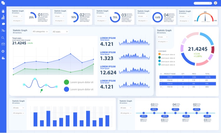
Creating A Power BI Dashboard
Let's face it, building a Power BI dashboard can be challenging. After you've gathered, cleaned, and modeled the data, you "only" need to visualize
Let's face it, building a Power BI dashboard can be challenging. After you've gathered, cleaned, and modeled the data, you "only" need to visualize it as a last step. Unfortunately, this step of the process is often more challenging than most people expect, and a lot of potential insightful data is never used because the final dashboard isn't user-friendly or doesn't target the audience.
In this article, I'd like to describe which steps you can take to ensure that the dashboard you design adds value to the end user.
Designing an effective Power BI dashboard is technically an easy task but may present challenges in practice. These challenges arise when the final results aren't as expected due to inappropriate dashboard design despite the time and resources spent on data collection, cleaning, and testing. The article provides steps to assist in designing a satisfactory dashboard. Results aren't guaranteed when simply following these steps, as a good dashboard design caters to specific purposes and audiences. Emphasized is establishing the Who - your target users, and understanding their data needs and interaction with the dashboard.

Other pivotal considerations include the type of device users will utilize to access the dashboard, their Power BI experience and the actions they desire to take from their data insights. Equally critical is identifying necessary data for decision-making. More often, companies battle with data overloads, convinced all the historical data at their disposal is vital for making decisions. However, much less data is needed, and it is necessary to distinguish the essential data ahead of the dashboard development process.
Understanding the Importance of Efficient Power BI Dashboard Design
An efficient dashboard design is essential for effective data visualization and meaningful insight extraction. It aids decision-making processes, and serves as an essential tool in any given business environment. Incorporating the end-user's perspective during the design process ensures tailored, user-friendly, and actionable insights. Moreover, understanding the vital data to be displayed eliminates the occurrence of data overloads, focusing only on the necessary data. These considerations allow for better strategic decisions and improved business operations.
Read the full article Creating A Power BI Dashboard
Learn about Creating A Power BI Dashboard

Creating a Power BI Dashboard can seem easy due to the drag-and-drop experience. However, the end results can be disappointing if the user does not understand how to create insights and use the data to take action. The key to success is to design the dashboard with the end-user in mind. The first step is to identify the audience. Who will be using the dashboard? How will they interact with it? What questions need to be answered?
The second step is to understand what data is truly needed to make decisions. It is important to discuss which data is essential before and during development. The third step is to develop a design vision. What is the purpose of the dashboard? What kind of visuals and interactions are needed? What type of story should the dashboard tell?
The fourth step is to create a prototype. This will allow the user to test the dashboard and provide feedback. The fifth step is to refine the design. This step allows the user to make changes and add any missing elements. Finally, the sixth step is to launch the dashboard. This is where the user can finally use the dashboard and start taking action. Following these steps will help the user create a successful Power BI dashboard that can be used to make decisions and take action.
More links on about Creating A Power BI Dashboard
- Create a Power BI dashboard from a report
- Jul 7, 2023 — Pin tiles to a dashboard · Open a report and select More options (...) > · Hover over a visualization to reveal the options that are available.
- How to Create a Dashboard in Power BI
- Jul 26, 2023 — Build a dashboard in Power BI · Select and open the Excel file report that will be part of the new dashboard. · Select More options (…), then Edit ...
- An Introduction To Power BI Dashboard [Updted]
- Feb 6, 2023 — Power BI is the only service that offers dashboards. A single page visualization with multiple charts and graphs to tell a story is called a ...
- Incredibly Easy Method to Create Power BI Dashboard
- How to Create Dashboard in Power BI · Step 1: Importing data · Step 2: Formatting · Step 3: Modeling · Step 4: Creating a KPI for Total Sales and Gross profit · Step ...
- How to Create a Dashboard in Power BI in 6 Simple Steps
- Signing Up and InstallationUnderstanding the User InterfaceSupported Data TypesConnecting and Configuring Data ConnectionsChoosing the Right Visualization TypeCustomizing ...Signing Up and InstallationUnderstanding the User InterfaceSupported Data TypesConnecting and Configuring Data ConnectionsChoosing the Right Visualization TypeCustomizing ...Signing Up and InstallationUnderstanding the User InterfaceSupported Data TypesConnecting and Configuring Data ConnectionsChoosing the Right Visualization TypeCustomizing ...
- How To Create a Power Bi Dashboard, Plus Examples
- 6 steps
- Power BI Dashboard Tutorial
- Learn how to create a dashboard in Power BI in this step-by-step tutorial, from loading your dataset to sharing your completed dashboard with your team.
- A Step-by-Step Guide to Creating a Power BI Dashboard
- The first step to creating a new dashboard is using the Power BI service left navigation pane. You can quickly follow Microsoft Office Power BI's guide as ...
Keywords
Power BI Dashboard Design, Power BI Design Strategies, Power BI End User, Power BI Data Strategy, Power BI Visuals Design