- All of Microsoft
Optimize Power BI: Highlight & Filter Mismatches Guide
Master Power BI: Highlight & Filter Data Mismatches with Ease!
Key insights
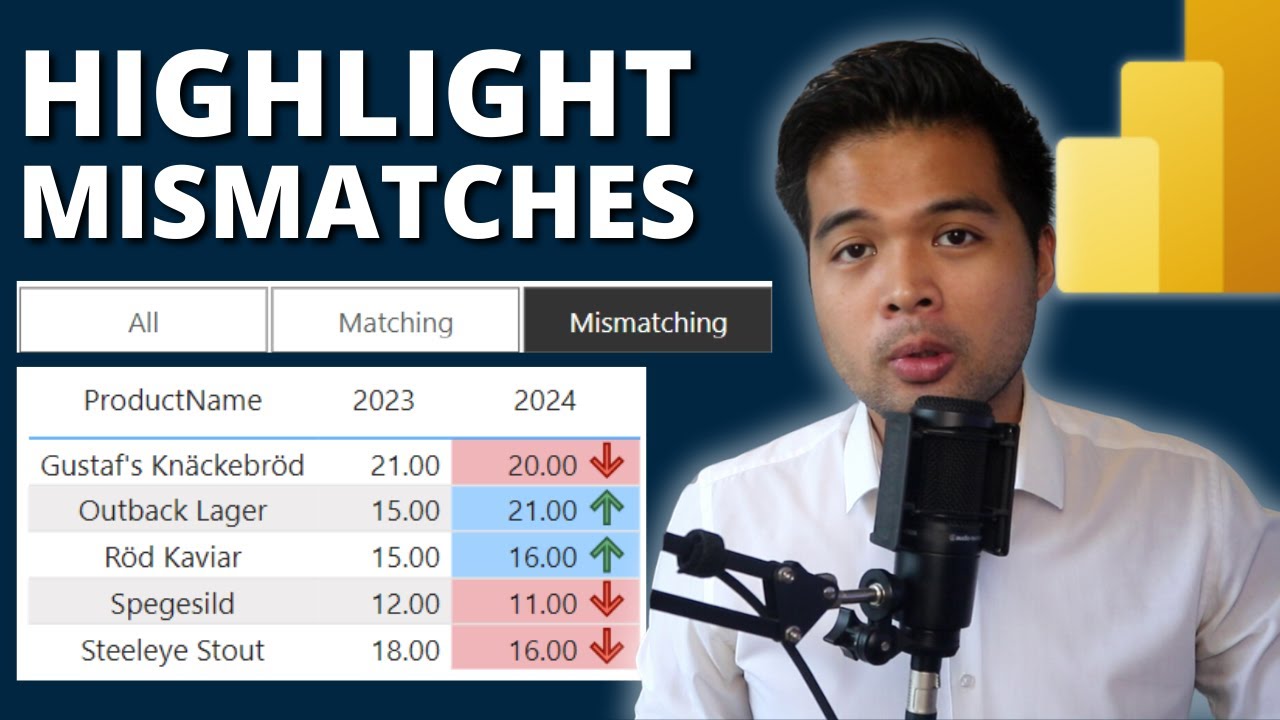
- Learn how to highlight and filter mismatches in Power BI reports, which is beneficial for comparing discrepancies between two datasets.
- Utilize a measure to create dynamic filters for tables, enhancing report interactivity and relevancy.
- Enhance your Power BI reports by adding colors and slicers to improve visual representation and user interaction.
- Gain essential data skills from beginner-friendly courses offered by Solutions Abroad, ideal for those new to the field.
- Access various resources like templates, courses, and a newsletter to stay updated and enhance your Power BI proficiency.
Power BI and Its Community
In a recent YouTube video by Fernan Espejo of Solutions Abroad, viewers are provided with a comprehensive beginner's guide on how to enhance their reports in Power BI by highlighting and filtering mismatches between two datasets. The video is designed to help even those with no prior experience by breaking down the steps into easily digestible segments. Fernan, a seasoned data analyst with over eight years of experience, leads the tutorial, ensuring that the knowledge imparted is both practical and applicable.
The featured content begins with an introduction to mismatch identification within data sets. This initial section sets the stage by illustrating the value of distinguishing between conflicting datasets, which is crucial for accurate data analysis and reporting. Following this, viewers are taught how to use specific measures within Power BI to apply filters to these mismatches, showcasing only what’s relevant on the tables.
Moving forwards, the tutorial introduces how to add visual enhancements to reports, such as color-coding mismatches for clearer understanding and more practical data presentation. This approach not only makes the discrepancies obvious but also helps in making reports more visually appealing. Additionally, Fernan integrates slicers into the reports, a feature that allows users to interactively segregate data according to different criteria directly from the report interface.
Despite its rich content, the video also serves as a promotion for further learning and engagement. Links to download demo files and other resources like courses and newsletters were provided in the video, though specific URLs are omitted here. Similarly, mentions of Solutions Abroad’s digital shop for purchasing templates were noted, alongside invitations to support the channel through donations or purchases, promoting an interactive community around the Power BI tutorials.
Overall, Fernan Espejo's YouTube guide to utilizing Power BI for highlighting and filtering data mismatches offers actionable insights and tools for beginners in data analytics. By imparting essential skills through an accessible format, Fernan contributes to the broader learning community interested in business intelligence and data handling.
Expanding on Data Analysis with Business Intelligence Tools
Data analysis and business intelligence tools like Power BI have transformed how businesses interpret large sets of data, enabling more informed decision-making. Through simple yet powerful functionalities such as mismatch highlighting and interactive filters, these tools facilitate a deeper understanding of underlying data patterns. The ability to visualize discrepancies through color-coding and apply interactive filters through slicers likewise empowers data analysts to delve into specifics, tailo...

People also ask
How do I highlight something in Power BI?
Answer: To highlight a particular element in Power BI, first access your report through the Power BI service. Choose the visual you're interested with, then click on the More options (...) dropdown, and select Spotlight for emphasis.What should you use to highlight a specific visualization in a report in Power BI?
Answer: To emphasize a specific visualization when data points, such as total cells, fall below a threshold like 150,000, set the visual's properties to display a distinct color, such as red.Which visualization can be used to filter the data in reports in Power BI?
Answer: Utilize slicers in Power BI to filter through data in your reports. Slicers function as independent charts available in various styles like category, range, or date slicers. They offer flexible formatting options allowing for single, multiple, or all-inclusive data selection.How to apply visual filters in PowerD BI?
Answer: To apply visual filters, first navigate to the Power BI service, then initiate the Edit mode to start modifying your report in the Editing view.
Keywords
Power BI Highlight Mismatches, Power BI Filter Tutorial, Beginners Guide Power BI, Power BI Reporting Tips, Power BI Data Analysis, Learn Power BI, Power BI Visualization, Power BI Tutorial for Beginners
