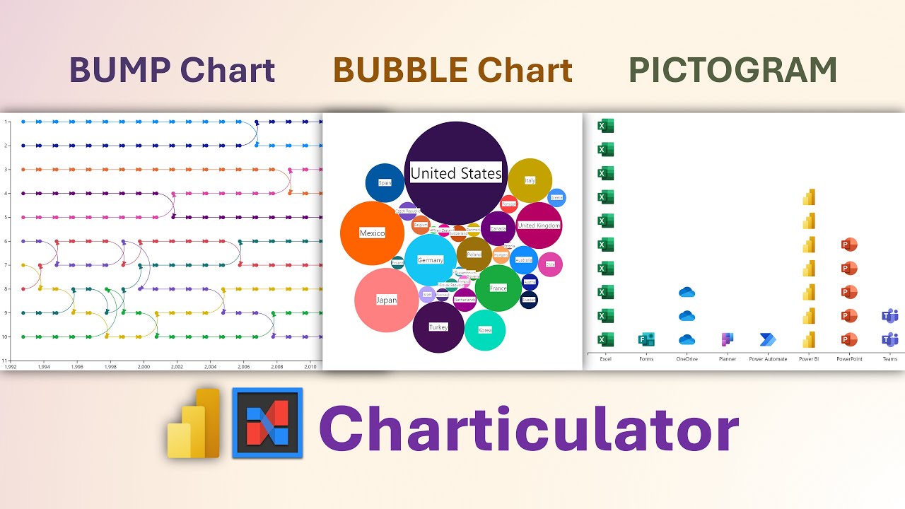
Create Stunning Power BI Charts: Bump, Bubble & More
Explore Power BI Charticulator: Master Bump, Bubble, & Pictogram Charts without Coding! #PowerBI #DataVisualization #DIYCharts
The video by 'Efficiency 365 by Dr Nitin' is an instructional walkthrough, guiding viewers through the use of Charticulator, an advanced visualization tool for Power BI. It teaches how to create three distinct chart types: bump, bubble, and pictogram. Viewers can download a sample file to practice and follow the tutorial.
Exploring Charticulator with Power BI
Charticulator is a tool designed to expand the visualization possibilities within Power BI, enabling users to design complex charts tailored to their specific storytelling needs. It allows for remarkable customization, blending creativity with data analysis. The tool integrates seamlessly with Power BI, making it an invaluable add-on for professionals looking to communicate insights through unique visuals. The video tutorial by 'Efficiency 365 by Dr Nitin' serves as a practical guide for users at all levels to create effective visual narratives using this versatile tool. As users become more adept at using similar tools for data visualization, it enriches the interpretive quality of reports and presentations, ultimately leading to better-informed decisions.
Understanding Power BI Charticulator: Creating Custom Visuals
Charticulator is a powerful visual tool inside Power BI. It enables the creation of bump, bubble, and pictogram charts in a straightforward manner. One can obtain a sample file and emulate the steps provided.
The tool for creating custom visuals within Power BI, known as Charticulator, was formulated by Microsoft Research. This instrumental feature permits the fashioning of complex charts effortlessly. It negates the necessity of coding skills making it accessible for non-developers.
Charticulator's utility shines through its capacity for producing visuals beyond Power BI's default offerings. It significantly augments Power BI's visualization arsenal. Users can immensely benefit from its advanced, coding-free customization options.
- Data Binding: Attach your Power BI dataset to Charticulator.
- Designing the Chart: Construct your chart using a variety of graphical components. Tailor these components based on your data to achieve the desired aesthetics and functionality.
- Exporting to Power BI: Integrate your custom-designed chart into Power BI for use in reports and dashboards.
Charticulator serves the purpose of generating intricate and detailed visualizations. These custom visuals aid in conveying data narratives more precisely. Hence, it's a valuable addition to Power BI's visualization tools.
Video Timestamps:
- 00:00 - Introduction to Charticulator visual
- 00:12 - How to install in Power BI
- 00:21 - Steps to create a visual
- 00:41 - Method of adding data to the visual
- 00:54 - Customization of the chart
- 01:08 - Inclusion of a symbol (glyph)
- 01:39 - Adjusting size according to population data
- 02:13 - Applying color based on country data
- 02:30 - Adding country name text to the chart
- 03:28 - Creating a Pictogram - Picture Chart
- 03:47 - Positioning an x-axis
- 04:04 - How to insert an image or icon
- 04:48 - Strategy for adding images for each product category
- 05:17 - Guide to creating a bump chart
- 06:10 - Procedure for adding columns to the chart
- 06:20 - Instruction for adding x and y axes
- 07:13 - Process of adding country symbols to the visual
Expanding Power BI Visualization with Charticulator
Data storytelling has become an essential aspect of business analysis, and the tools to facilitate this are continuously evolving. Among them, Charticulator stands out as an innovative means to extend the visualization capabilities offered by Power BI. By allowing non-technical users to create complex charts that cater directly to their data stories, it paves the way for nuanced and impactful data presentations. Its intuitive interface fosters an environment where creativity meets data, unlocking a realm of possibilities for personalized data expression.

People also ask
How do you read a bump chart?
A bump chart is used to show changes in rank over time. To read a bump chart, you identify the time period on the horizontal axis and the rank on the vertical axis. Lines represent different entities (like products, teams, or countries), and their position changes over time to reflect fluctuations in ranking. As you follow a line from left to right, you can observe how the rank of an entity increases or decreases relative to others.Is there a bubble chart in Power BI?
Yes, Power BI does offer bubble charts as part of its visualization options. Bubble charts in Power BI enable users to represent data points with bubbles, where the bubble size can depict an additional data dimension, such as sales volume or profit, providing a way to analyze three variables at once. By adding a bubble chart to a report, users can display and compare their data graphically in a more dynamic and informative way.How do you create a lollipop chart in Power BI?
To create a lollipop chart in Power BI, you start by adding a new visual to your report and selecting a scatter chart. Next, you add your category to the Axis field, and the measure you want to analyze to the Size field, and another instance of the measure to the Y-Axis field. You would typically adjust the size of the scatter points to be minimal, forming the 'dot' of the lollipop. Then, use a line or bar chart as a 'stick' by placing a measure on the Y-Axis and adjusting its color and size to complete the lollipop chart appearance. However, as of my knowledge cutoff date in 2023, Power BI does not have a default lollipop chart visual, so users either use this workaround or import a custom visual from the Power BI Visuals Marketplace that is designed specifically for creating lollipop charts.Keywords
Power BI Charticulator Tutorial, Bump Chart Visualization, Bubble Chart Analysis, Picture Chart Creation, Data Visualization Techniques, Power BI Custom Visuals, Charticulator Walkthrough, Interactive BI Charts, Advanced Chart Design Power BI, Visual Analytics Power BI
