Explore the Enhanced Power Automate Interface 2024
Discover the Pros and Cons of Power Automates New UI: Whats Hot, Whats Not in Flow Development?
Key insights
Insights into the New Power Automate UI
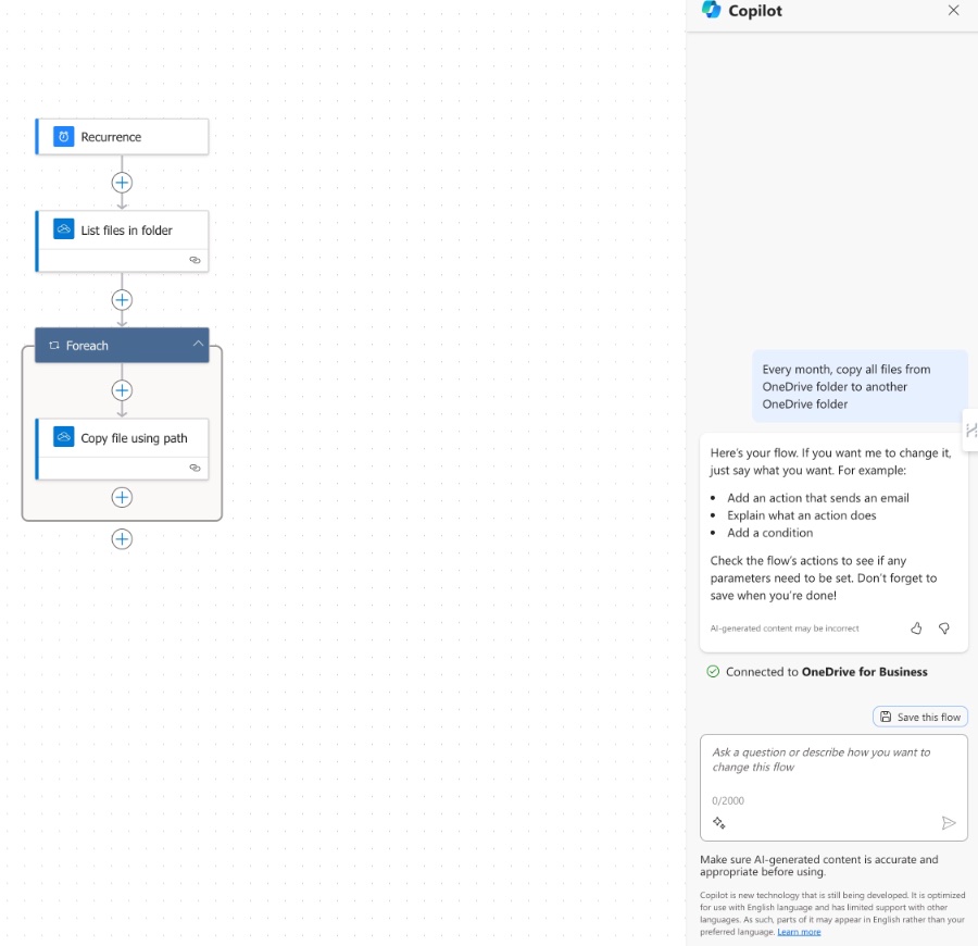
Ami Diamond addresses the recent updates to the Power Automate UI, sharing insights and engaging with user feedback. Discussions center around the new features, their functionalities, and areas where the new UI is lacking. Ami actively explores these features through a series of "Hits," "Misses," and "If Onlys" sections.
- Under "The Hits," Ami notes the modern look of the new UI compared to the dated appearance of the classic version, appreciating the intuitive "Do Until" action visual and the enhanced pan and zoom capabilities which ease navigation. Improvements in filter actions, static result functionality for mocking outputs, and some shortcut keys are highlighted as positive changes. The side panel design, although it has mixed reviews, is seen as beneficial for a big-picture approach to development.
- As for "The Misses," issues with copy and paste functionality, the absence of an HTML button for email actions, a non-intuitive trigger default that doesn't split, missing undo/redo buttons, and difficulty with open multiple actions for review are noted as downsides.
- The section labeled "If Onlys" lists missed opportunities, such as combining the side panel with action inputs for a more adaptable workspace, enhanced filter functions, improved copy and paste options, more advanced debugging tools similar to Chrome's Dev tools, and the addition of a find and replace capability.
Ami concludes with the perspective that while Microsoft has made right design choices, the rollout was flawed. Critically, the new UI lacks essential features present in the classic version and fails to offer compelling new functions to make the transition worthwhile for experienced developers.
Further Discussion on the Power Automate UI
Power Automate's UI transition mirrors the challenges many software updates face when balancing innovation with user familiarity. A new UI often aims to streamline workflows and introduce modern functionalities but can encounter resistance if it disrupts established user practices. Key concerns include maintaining feature parity with old versions to prevent workflow disruption. Moreover, new introductions must be substantial enough to justify the transition, especially for professionals ingrained in their routines. Above all, effective communication and feedback mechanisms are crucial to ensure that upgrades align with user needs, maintaining productivity while progressing with technological advancements.
David Wyatt shares his experience with the new Power Automate UI, acknowledging the community's mixed feelings. Wyatt dives into his analysis categorizing them as 'The Hits', 'The Misses', and the 'If Onlys'.

The new UI's modern look, with its clean lines and Windows XP departure, has won users over, and the 'Do Until' action has become a favorite for its code-like visibility. Accessibility improvements, such as pan and zoom functionality, allow for a more comprehensive view of workflows than the classic UI.
Filter actions in the new interface are more convenient, and the 'Static Result' feature is praised for allowing actions to be tested as if they have succeeded without actually performing the operation. Shortcut keys for adding variables have been introduced, though they are quite basic at present.
The side panel is a contentious feature. While it requires more cursor movement, the big-picture development perspective it fosters is ultimately seen as a productivity boon. It's anticipated that developers will adapt to the further zoomed-out default setting for an improved workflow.
On the downside, the initial release's lack of copy-paste functionality drew significant criticism, though it has been partially addressed. The inability to copy containers and the 'one action at a time' memory can hinder productivity. Surprisingly, HTML support in emails was overlooked, and the new UI defaults to a non-splitting trigger behavior, contrary to typical development needs.

Lacking basic undo/redo features and the inconvenience of single-action visibility during code reviews are major drawbacks. Navigate and zoom functionality trade-offs are also noted, particularly when debugging or code-reviewing, which could impact development efficiency.
Wyatt suggests that missed opportunities for the new UI include a hybrid action view mode toggling between zoom levels, and a favorites filter for frequently used actions. The potential for enhanced copy-paste functionality and more robust developer debugging tools are highlighted, along with the addition of basic features like 'find and replace'.
In conclusion, Wyatt acknowledges that while he initially disliked the new UI, it has potential with the right development choices. However, the rollout was mishandled and lacked readiness for general use. Feature parity and pro-developer features are needed for successful adaptation, beyond the allure of Copilot.
Final Thoughts
Initially skeptical, Ami realizes that the direction Microsoft has taken with the New UI is essentially sound, but the execution of its rollout was flawed. The UI was prematurely released, missing key features and lacking appeal for professional developers.
To successfully transition to the New UI and engage professional developers, Microsoft needs to achieve feature parity with the Classic UI and introduce compelling new features. Currently, the misses overshadow the potential gains, but with focused improvements, the New UI could become a tool that embodies both innovation and familiarity.
Read the full article Let's Talk About The New Power Automate UI

People also ask
What is UI flow in Power Automate?
UI flow in Power Automate is a feature that allows users to automate the repetitive tasks on the web and desktop applications by recording and playing back user interface actions. With UI flows, manual tasks such as data entry, clicking, and keyboard operations can be automated, which helps users create workflows for applications that do not support API automation. UI flows integrate with the existing components of Power Automate to provide a more comprehensive automation solution for end-to-end processes that require human interaction with the UI.What is the overview of Power Automate?
Power Automate is a service provided by Microsoft that enables users to create automated workflows between their favorite apps and services to synchronize files, get notifications, collect data, and more. It is designed to improve productivity through automation across a wide array of predefined connectors and uses a simple, no-code interface, allowing users to seamlessly create their custom workflows. Along with readily available templates and AI capabilities, it can help streamline business processes while integrating with other Microsoft 365 offerings such as SharePoint, Office 365, and Dynamics 365, as well as various third-party applications.
Keywords
New Power Automate UI, Power Automate Redesign, Power Automate Interface Update, Power Automate UI Improvements, Updated Power Automate Experience, Power Automate UI Changes, Latest Power Automate User Interface, Modern Power Automate UI, Power Automate UI Features, Power Automate UI Enhancements