Latest Updates on Power BI: Enhancing Accessibility Features
Explore new accessible color themes in Power BI reports, designed with visual disabilities in mind, to enhance report inclusivity.
Improvements in Power BI and Accessibility
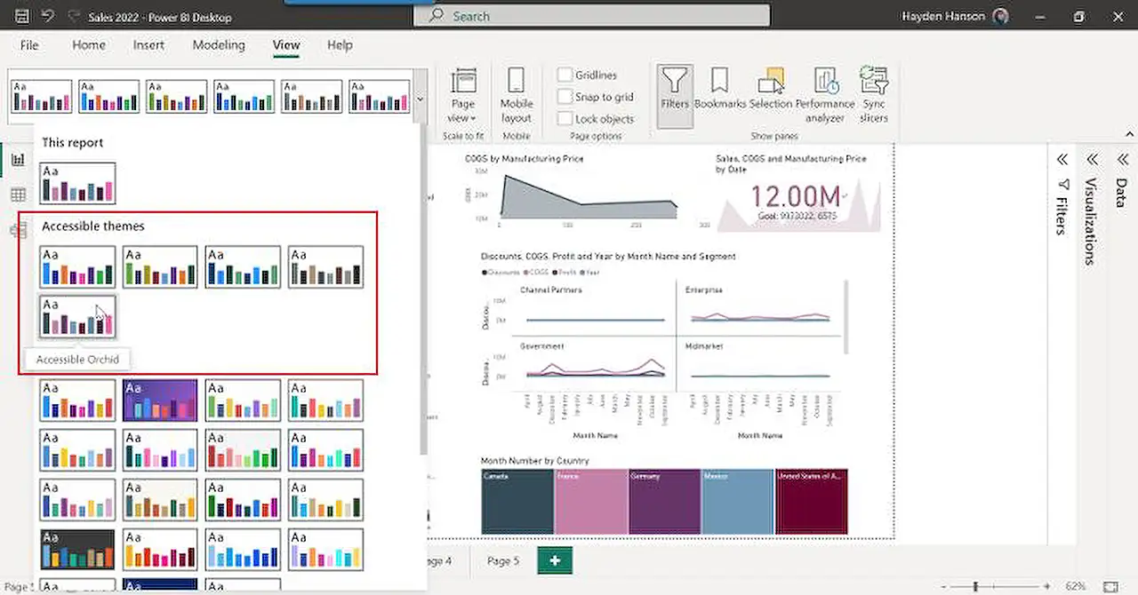
In the realm of Power BI and Accessibility, we have witnessed thrilling enhancements consisting of the introduction of five new color themes meant to support accessibility: Accessible Default, Accessible City park, Accessible Tidal, Accessible Neutral, and Accessible Orchid. The purpose behind these new themes is to simplify the creation of stunning, accessibility-oriented reports.
Around the world, more than 2.2 billion individuals suffer from some variety of visual impairment, with an estimated 300 million people affected by CVD (color vision deficiency). Reports are usually built based on our capabilities and work habits, but it is crucial to consider the audience for whom the reports are created. Approximately 70% of disabilities are invisible, hence you may be unaware if a team member or someone on your distribution list has a visual impairment. Designing and sharing accessible content supports those with disabilities.
This post centers on the relevance of selecting accessible colors and illustrates how you can utilize the new themes for creating more inclusive reports in Business Intelligence platforms using just two easy steps.
The Role of Color in Accessibility
The employment of color to facilitate accessibility includes choosing hues that provide contrast between the content, background, and adjacent colors, ensuring legibility for text and graphics. Providing a relative luminance of 3:1 or greater makes items more distinguishable when a person does not see a full spectrum of colors.
According to the Web Content Accessibility Guidelines (WCAG) – an internationally recognized standard for web content accessibility, there are several success criteria that a visual or report must meet in order to be considered color accessible. For data visualizations and reports, any parts of shapes or graphics crucial for comprehending the content must bear a contrast ratio of a minimum of 3:1 against adjacent colors.
The new Accessible themes comply with this success criterion, but there are a few exceptions like line charts where, depending upon your data, lines might fall adjacent to other lines that do not meet this contrast ratio. It is the report author’s responsibility to ensure their visuals and reports meet their organization's criteria before distribution. Regardless of not having a visual disability, individuals can still appreciate a color palette that is not distracting.
Understanding Themes in Business Intelligence Platforms
These platforms incorporate standardized color schemes and formatting options as themes that can be applied to your whole report, including graphics, text, and shapes. These themes can be used to maintain consistency throughout your report without the need to modify each element individually.
Applying an accessible color theme is quite straightforward. Themes are located under the "View" tab in these platforms’ desktop applications. You simply browse for the theme and select the thumbnail image of the theme you desire. The application will automatically update your report colors to the chosen accessible theme. Remember to look for the term "Accessible" in the theme names to support accessibility compliance.
The Future of Accessible Themes
We are excited to hear your thoughts on other color combinations for our future Accessible themes release. We encourage you to provide your feedback and cast your votes on other features you wish to see in Business Intelligence platforms.
Subsequent enhancements in BI platforms promise to be even more user-friendly and accessible, ensuring more inclusivity in report building.
Read the full article Exciting news in the world of Power BI and Accessible

Learn about Exciting news in the world of Power BI and Accessible
Big advancements are taking place at the forefront of Power BI and accessibility. As Microsoft experts, we are elated to communicate that five fresh color themes have been launched to further support accessibility. These are Accessible Default, Accessible City park, Accessible Tidal, Accessible Neutral, and Accessible Orchid. The addition of these themes simplifies the process of crafting visually appealing reports which also accommodate accessibility needs.
- About 2.2 billion individuals globally live with certain forms of visual impairment.
- Around 300 million people across the world are estimated to have CVD (color vision deficiency), with about 8% of all men and 0.5% of all women being color blind.
- As a person grows older, color vision gradually deteriorates.
We tend to design reports based on our own capabilities and work habits. While this approach seems natural, it is essential to consider the recipients of these reports. Considering that more than 70% of disabilities don't have visible symptoms, the likelihood is high that you have someone on your list or in your team who struggles with visual impairments. The creation and dissemination of accessible content thereby facilitate the empowerment of individuals coping with disabilities.
This article aims to shed light on the significance of choosing accessible colors in our Power BI solutions. The implementation of accessible colors not only enhances the visual appeal of reports, but also makes your content more inclusive. Let's look at how these new themes can accomplish this in just two steps.
- It's important to understand the role of colors in making your content accessible.
- Choose colors that contrast with the content, background, and adjacent colors, thereby improving the readability of the text and other visuals.
- Ensure a relative luminance of 3:1 or greater to help those with color vision deficiencies distinguish the content.
Web Content Accessibility Guidelines (WCAG) mandate several success criteria that must be met for a visual or report to be color accessible. One of the requirements is ensuring the color contrast ratio between shapes or graphics and their adjacent colors is at least 3:1. While the new Accessible themes mostly meet these criteria, there may be situations where a manual review is necessary. For instance, in line charts, depending on your data, some lines might end up next to lines with inadequate contrast ratios. Ultimately, the onus is on the report author to ensure their visuals and reports are accessible and comply with their organization's standards.
Keep in mind that using a color palette that isn't overly straining or distracting would also be appreciated by those without visual disabilities. This is especially considering the number of individuals who might be negatively impacted by these visual categories as our population ages.
Bi reporting tool themes are standardized color schemes and formatting options that can be applied across your report. These themes maintain consistency in your report without going through the hassle of changing each element individually.
The application of an accessible color theme is a breeze. All you need to do is look for the color themes under the “View” tab in the BI desktop.
- Search for the theme that you desire.
- Choose the thumbnail image of the theme you wish to apply.
Following these steps, your report colors will be automatically updated to the chosen accessible theme. Note that themes designated to support accessibility compliance will include the term “Accessible” in their names.
Do you have other color combinations that you want to see in our upcoming Accessible themes? Please share your thoughts and remember to vote for other features you desire to see in the power BI system on our community website.
We eagerly await your feedback! Curious about more ways to make your reports more accessible? Discover more about designing the BI reports for accessibility.
More links on about Exciting news in the world of Power BI and Accessible
- Exciting news in the world of Power BI and Accessible
- Feb 13, 2023 — We are thrilled to announce that we released five new color themes to support accessibility (Accessible Default, Accessible City park, ...
- Power BI Blog—Updates and News
- Keep up with the latest Power BI updates, announcements, information, and new features on the Power BI blog. Search by category or date published.
- Power BI Blog—Updates and News
- Keep up with the latest Power BI updates, announcements, information, and new features on the Power BI blog. Search by category or date published.
Keywords
Power BI news, Power BI updates, Accessible Power BI, Power BI developments, Accessible technology, BI accessibility, Business intelligence updates, Power BI enhancements, Power BI advancements, Accessible BI software