Ultimate Data Visualization Guide - Insider Secrets!
Unlock Secrets of Engaging Data Visuals in Excel & PowerPoint with Our Crash Course!
Key insights
- Data visualization techniques are crucial for conveying messages effectively.
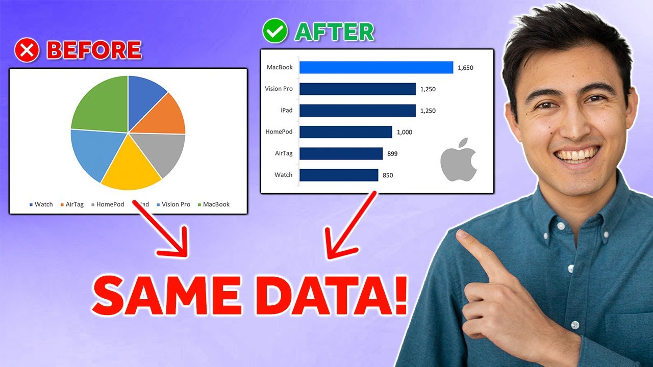
- Choosing the right chart type is essential for clear visual communication.
- Color theory and formatting play vital roles in enhancing chart comprehensibility.
- Preattentive attributes help in drawing attention to key aspects of data visualizations.
- Writing effective action titles can significantly improve the impact of visuals.
Understanding the Essence of Data Visualization
Data visualization is a powerful tool in the world of information technology and business intelligence. It involves transforming raw data into meaningful visuals that can be easily understood at a glance. The essence of data visualization lies not just in the representation of numbers but in telling a story that informs, influences, or drives action. The right combination of chart types, color schemes, and presentation techniques can significantly affect the clarity and effectiveness of the conveyed message. Moreover, understanding preattentive attributes and how they can direct viewers' attention to important data points is crucial. Additionally, the capability to craft compelling action titles that encapsulate key insights paves the way for impactful presentations, whether in Excel, PowerPoint, or any other platform. This seamless integration of art and science makes data visualization an indispensable skill in today’s data-driven world.
In a comprehensive data visualization crash course, Kenji Farré, renowned for his expertise and recognized as a Microsoft Most Valuable Professional (MVP), shares invaluable insights on how to craft compelling visuals. This course is designed to equip viewers with the knowledge necessary to select appropriate chart types, effectively use color theory, and leverage preattentive attributes for enhanced chart formatting. Farré emphasizes the significance of writing action-oriented titles to convey messages clearly and powerfully.
Farré breaks down the tutorial into easily digestible chapters, starting with the basics of chart types before moving on to more complex concepts like colors and formats. He also delves into the psychology behind preattentive attributes and how these can be utilized to direct viewers' attention to key information. The tutorial culminates with guidance on formulating action titles, a crucial step towards making data visualization not just informative, but also persuasive.
The skills taught in this video are not bound to a single tool; instead, they are applicable across various platforms including Excel and PowerPoint. This makes Farré's crash course a versatile resource for consultants, analysts, and anyone interested in improving their data visualization capabilities. By integrating these best practices, viewers can expect to elevate their visuals from mere representations of data to compelling narratives that effectively communicate their underlying message.
- Understanding the significance of choosing the right chart type for your data.
- Applying color theory and formatting to enhance visual appeal and readability.
- Utilizing preattentive attributes to draw attention to key aspects of your visuals.
- Mastering the art of writing effective action titles to drive home your message.
Expanding Upon Data Visualization Skills
Mastering data visualization skills is essential in today's data-driven world. The video by Kenji Farré offers a foundational look into creating effective and engaging visuals. As data becomes increasingly integral to decision-making across industries, the ability to not only analyze but also visually communicate data sets you apart. By focusing on elements such as the appropriate selection of chart types, the strategic use of colors and formats, the advantage of preattentive attributes, and the crafting of succinct action titles, viewers are equipped to design visuals that stand out and effectively communicate their intended message.
Data visualization tools like Power BI offer a powerful platform for professionals to apply these skills. However, the principles outlined in Farré's video extend beyond any single tool, touching on the core aspects of visual communication. Understanding your audience, the story your data tells, and how to best narrate that story visually are universal skills that enhance one's analytical and presentation capabilities. This crash course acts as a stepping stone for individuals aiming to delve deeper into the field of data visualization, encouraging a practice-oriented approach to mastering these indispensable skills.
Whether you're a consultant seeking to present data more persuasively, an analyst aiming to make your findings more accessible, or simply a professional looking to improve your presentation skills, Farré's data visualization crash course offers a wealth of knowledge. The lessons learned here pave the way for creating visuals that not only convey information but also inspire action, making data a compelling protagonist in your narratives.

People also ask
What is the most common problem in data visualization?
One hurdle in data visualization is the misinterpretation that could arise from high color contrasts, leading viewers to perceive value differences to be more significant than they are in reality. For instance, heatmaps utilize colors to signify the magnitude of values.
Is data visualization hard to learn?
Mastering the art of creating impactful data visualizations demands considerable time and dedication. This domain necessitates fluency in various tools and software like Excel and Tableau, each potentially requiring weeks to months for the average individual to proficiently learn.
What are the 4 types of bad data visualizations?
Poor examples of data visualization and strategies for avoidance include: employing inappropriate visuals, generating confusing labels and descriptive text, overcomplicating visuals with excessive elements, utilizing an inconsistent color scheme, failing to craft a coherent narrative, and neglecting visual hierarchy considerations.
How to visualize data without coding?
Tableau Public offers a powerful suite of tools for data storytellers, with the advantage of being a cost-free solution, though it's important to note that all creations are publicly accessible. It enables users to effortlessly produce engaging interactive graphs, maps, and real-time dashboards within minutes, eliminating the need for coding expertise.
Keywords
Data Visualization Course, Learn Data Visualization, Data Visualization Tutorial, Advanced Data Visualization Techniques, Data Visualization Guide, Data Visualization Tips, Data Visualization Crash Course, Data Visualization Secrets
